supermodular.ai
A word with no picture
supermodular.ai puts AI inside large organisations. Not demos, not pilots. Custom systems and agents that change how a company designs, builds and ships, for enterprise clients across Europe.
The proposition was clear. The word was not.
Modular is an idea, not an image. And in enterprise technology it already comes with a look: grids, blocks, stacked rectangles, shapes clicking neatly into place. We mapped the category and found most of it already living there.
Going there too would have said modular and stopped. It wouldn't have said why modularity matters: the thing being assembled has to keep changing after you build it.
So we started somewhere without a single grid in it.
The biological shape-shifters
Mesenchymal stem cells do something most cells cannot. They differentiate. The same cell becomes bone, cartilage, muscle, or fat, depending on what the body needs and where it ends up.
One organism. Many forms. Nothing bolted on, nothing swapped out.
That is modularity, except alive. Not a system assembled from parts, but one that becomes the thing required. It is a far more honest description of what supermodular.ai does inside a company than any arrangement of blocks.
Supermodular is a living organism. That line became the foundation, and everything after it had somewhere to come from.
Built from cells
We went to the microscope for the visual language, and stayed there longer than we expected.
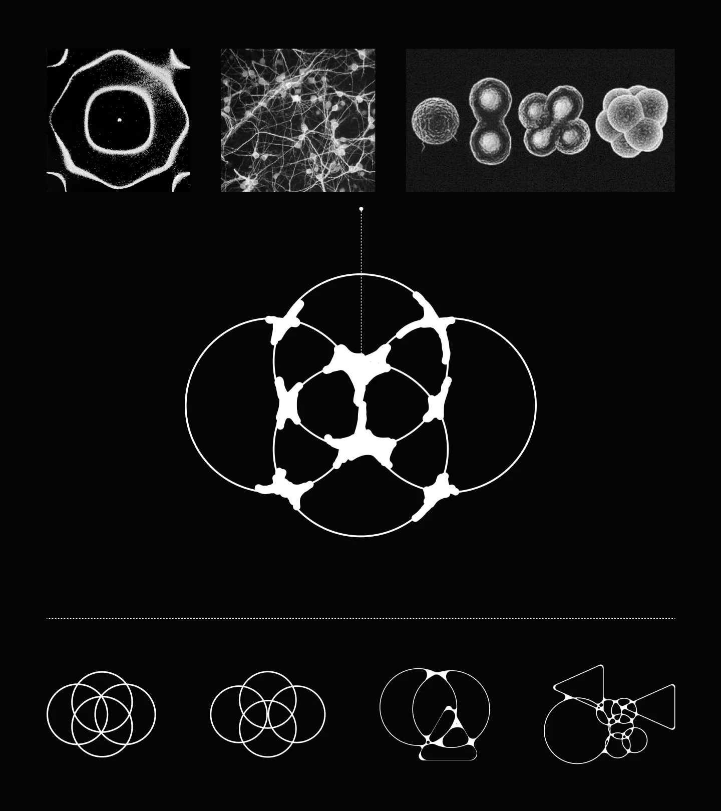
Cell cultures under electron microscopy. Colonies dividing and clustering. Circle packing, where round things crowd together and deform each other without ever losing their own edges. The symbol came out of that, built from overlapping circular forms that read as one shape at a distance and as many up close.
Colour did the rest of the work. Acid lime against black and white, closer to a lab than a boardroom. It is the brightest thing in a category that dresses almost exclusively in navy, and it does what the metaphor asked for: something living in a room full of infrastructure.
Type and layout stayed quiet on purpose. When the symbol is doing this much, everything around it should hold still.
Putting it on the page
A metaphor is only worth what it survives and the website was where it had to hold.
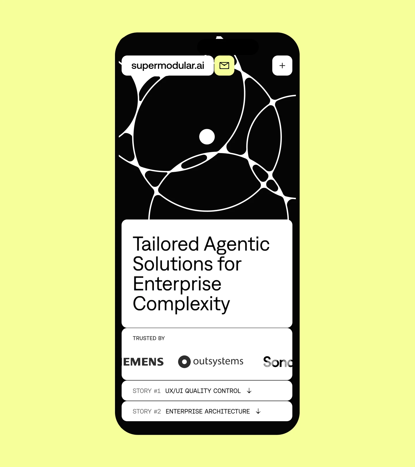
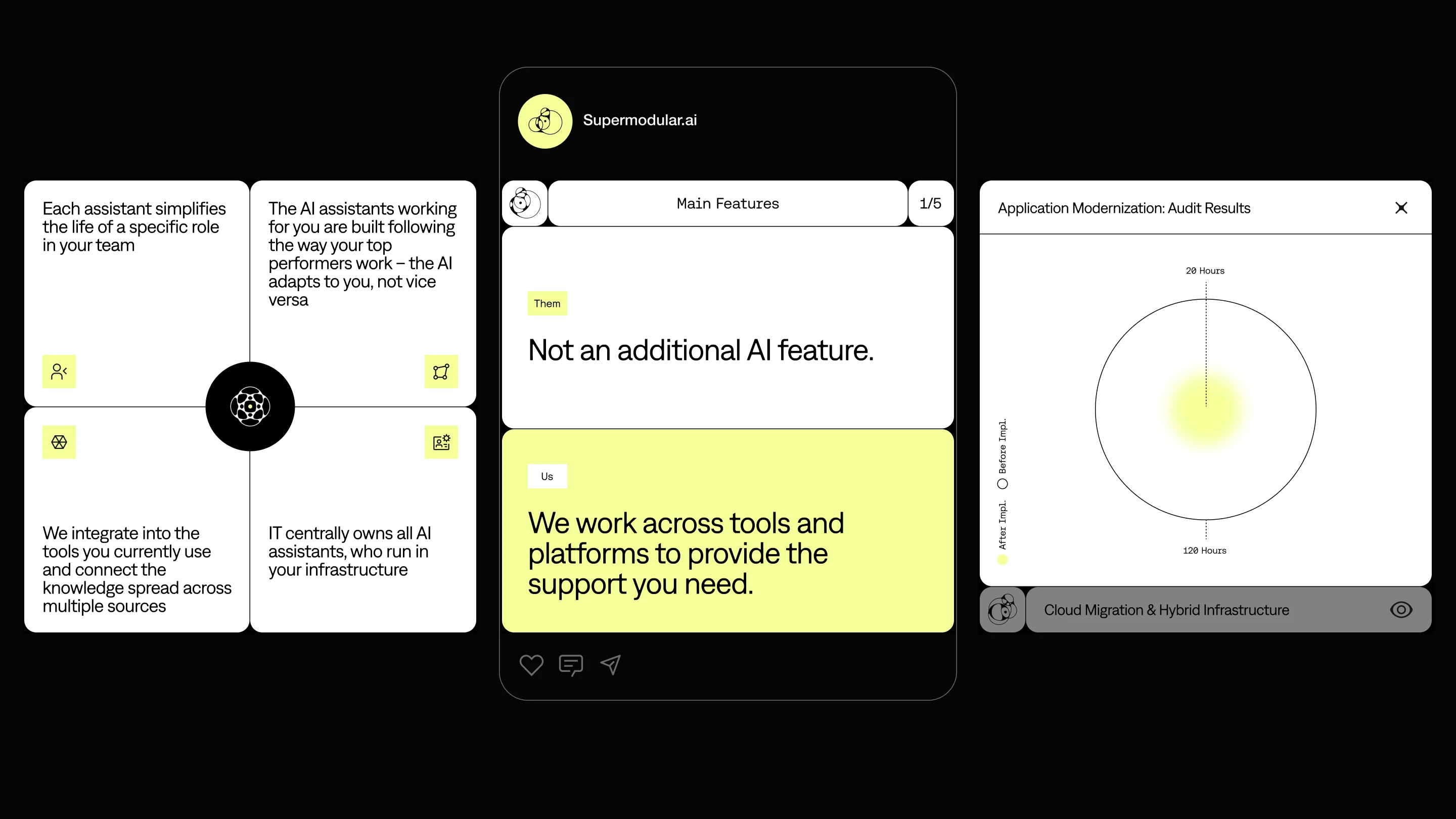
The page is built to be moved through rather than read. It marks your progress as you scroll, and the identity arrives in pieces instead of all at once, with acid lime reserved for the parts that are working.
At the center of it is the Nucleus diagram. Use cases sit on agents, agents sit on Nucleus, Nucleus sits on data. One core that differentiates into whatever a client needs.
We did not invent that architecture. It is how the product genuinely works. But the brand and the engineering had arrived at the same shape independently and the site was where we got to show it.
The impact stories run the idea again. One structure, three times: the goal, the solution, the numbers before and after. Same frame, completely different content each time. The page behaves the way the company does.