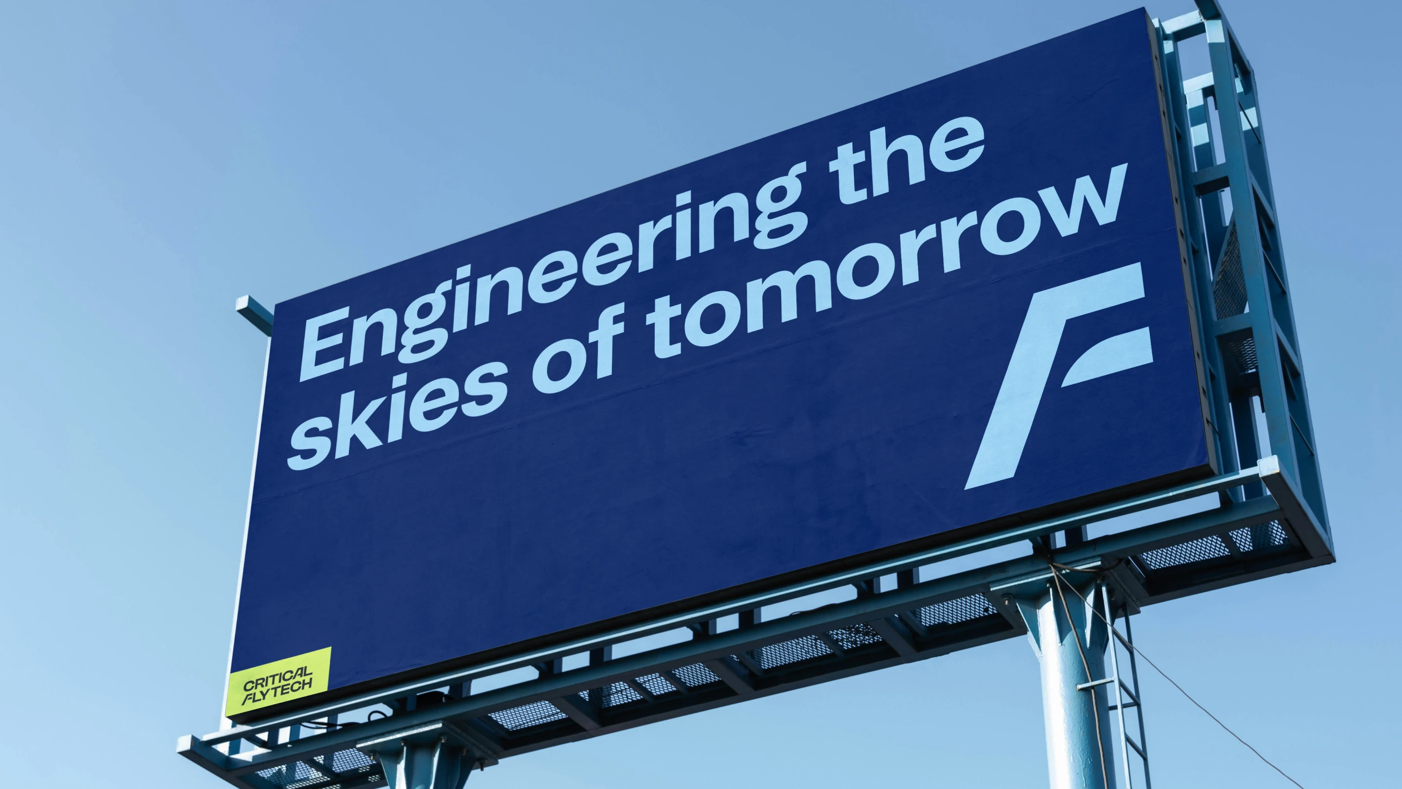
Critical Flytech
Born between two giants
Critical Flytech is a joint venture between Airbus and Critical Software.
One builds the aircraft much of the world flies on. The other started in 1998, when three engineers finishing their PhDs at Coimbra University wrote a series of technical articles about how software fails. An engineer at NASA's Jet Propulsion Laboratory read them. That is why Critical Software exists, and why there is a fault injected into a triangle in its logo that nobody has ever been allowed to remove.
Neither of them had anything left to prove. The new company did.
Flytech had to carry the institutional weight of one parent and the agility of the other without becoming a footnote to either. Fresh, young, bold. And built to do one very specific job: hire engineers.
The room it had to live in
Before drawing anything, we mapped where this brand would actually stand.
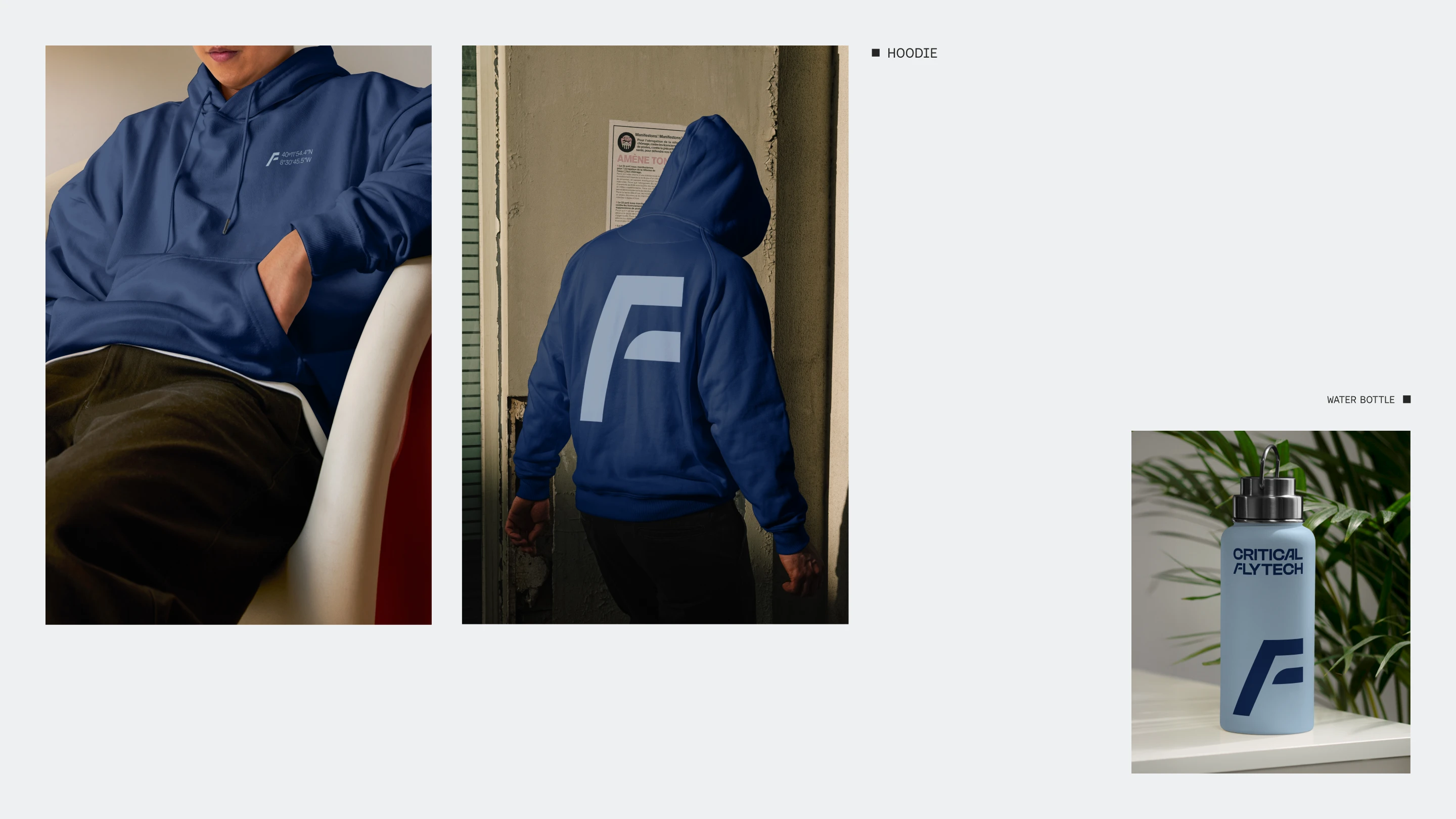
Flytech had to be readable in both rooms. Serious enough to sit beside an Airbus company. Human enough that a 25 year old engineer would want the hoodie.
That gap is where the identity lives.
The shape that steers
The symbol comes from the vertical stabilizer and rudder. The parts that decide where it goes.
Wings carry you. The tail decides where you end up. Choosing the second one gave the mark a precise idea to hold instead of a picture of flight. Control, direction, the discipline of keeping a line.
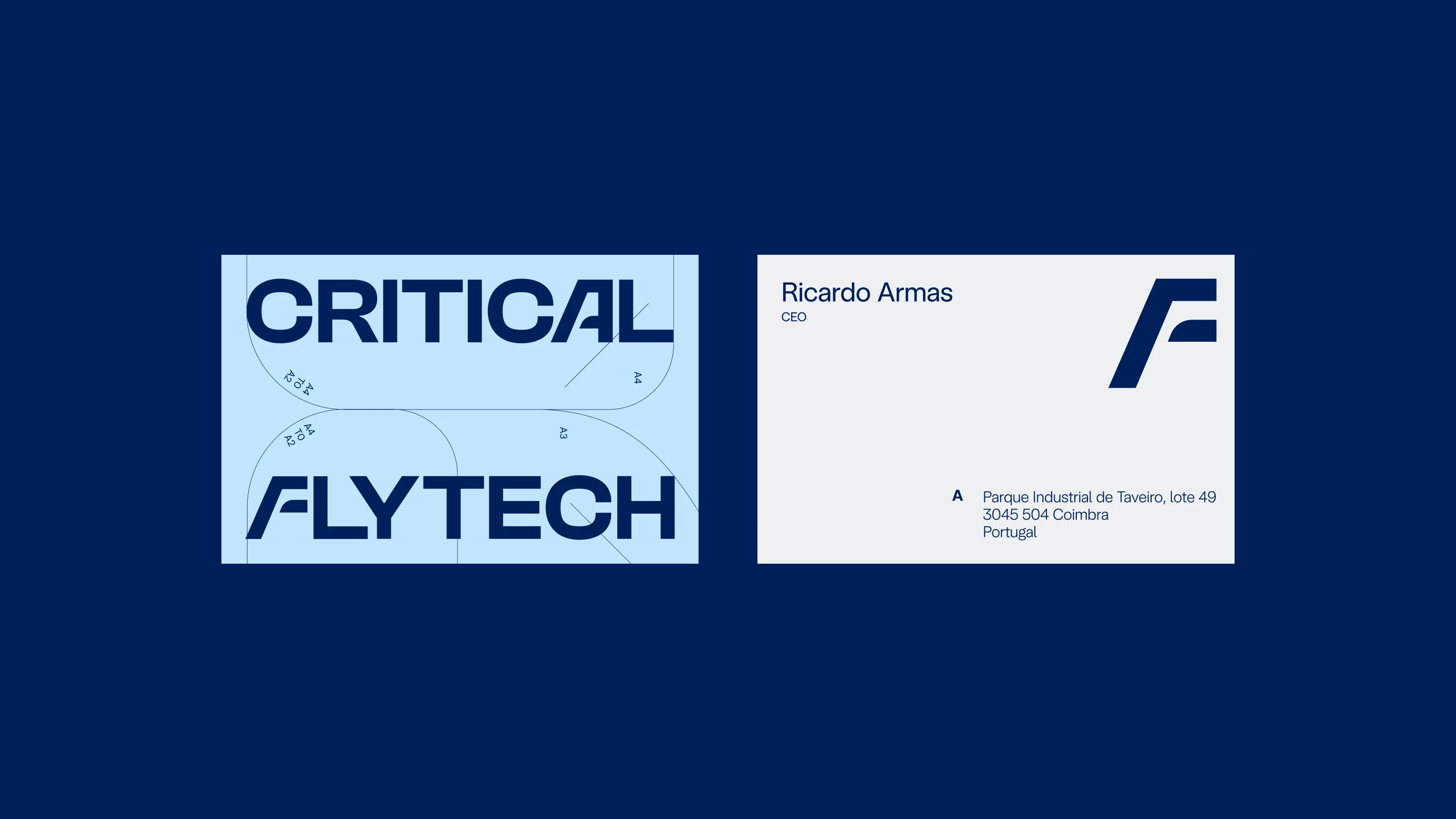
Then we refined it with two details only the parents would recognize. The angle of the "A" in the Airbus logotype. The rounding of the fault in the Critical Software mark. Both carry through into the letterforms.
Color did the rest. Cold blues moving into warm orange and a sharp yellow, built on sunrise tones. Two temperatures in one system, which is the most honest description of what this company is. Layout borrows from the early days of computing: a directory path, color blocks pushed hard against the edges, a "/" running through the navigation. Engineers recognize it on sight.
Built for launch day
An identity for a company that does not exist yet has to arrive complete.
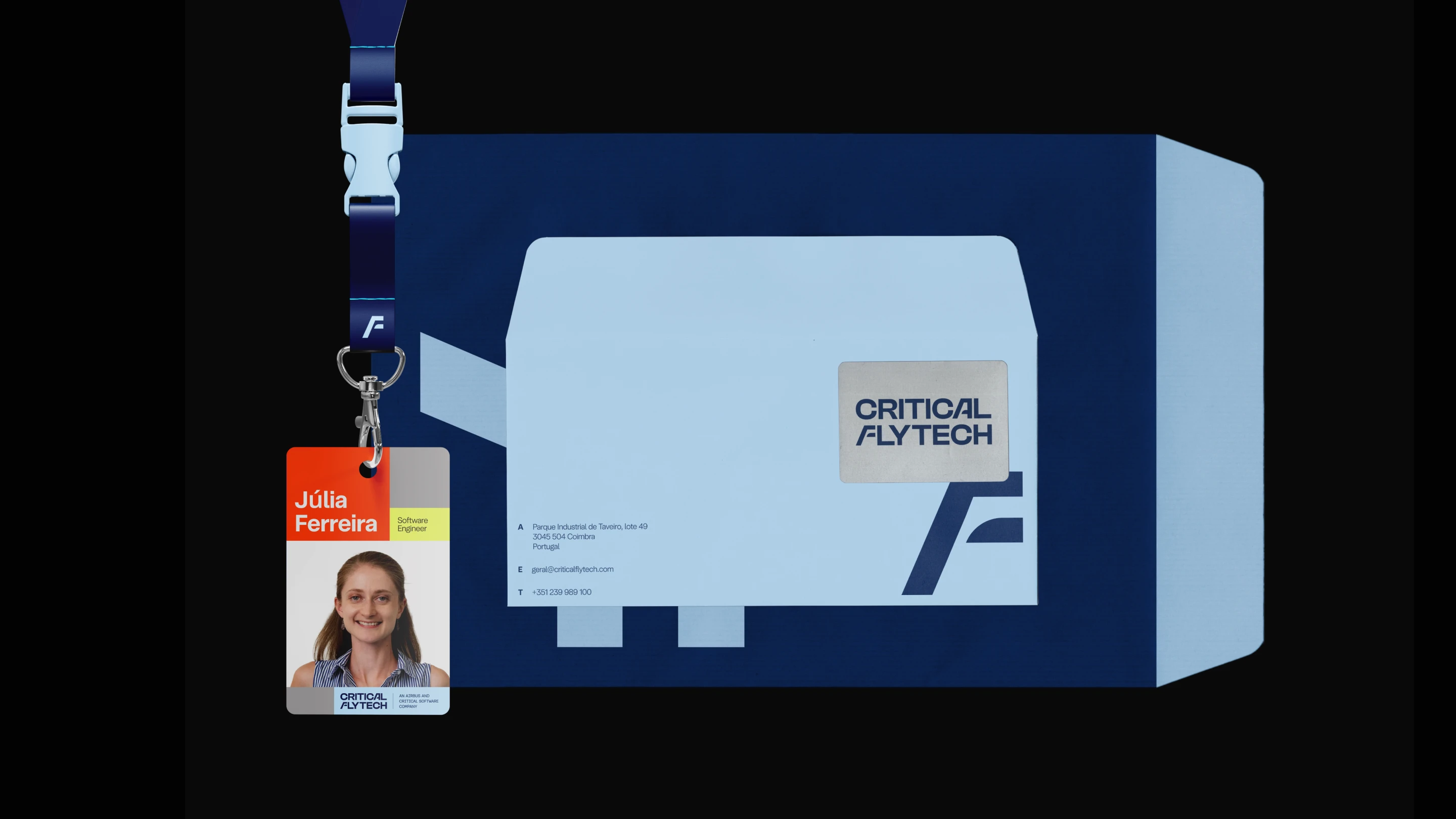
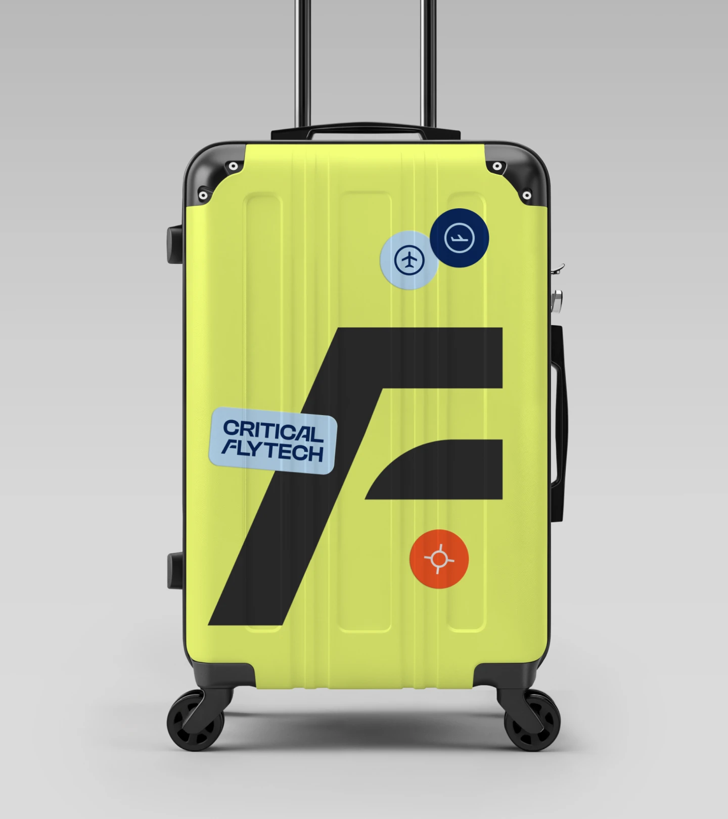
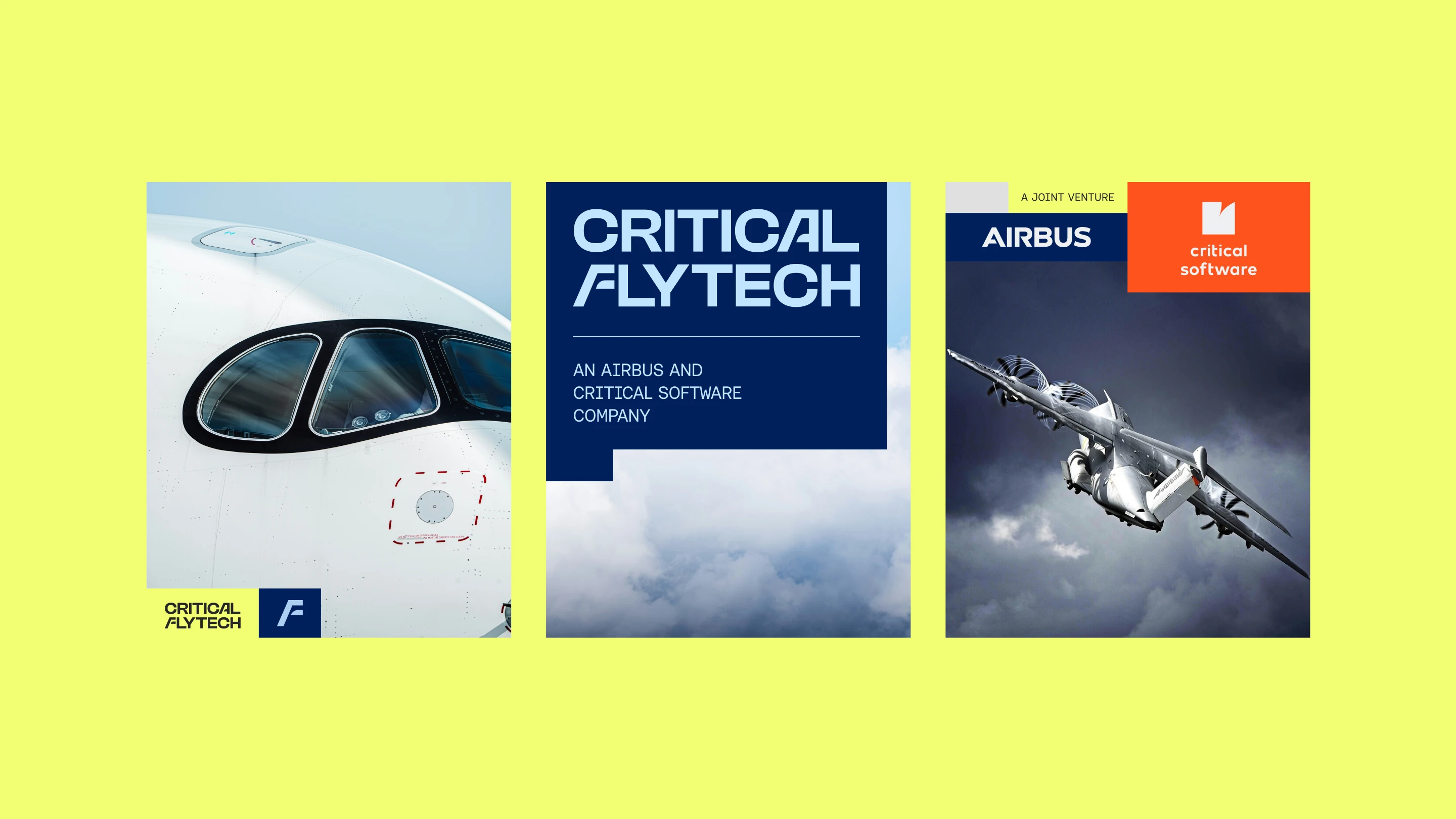
The press image carrying all three marks together. The animated logo and tagline. Profile art, hiring posts, stationery, ID badges, merch, signage, and a full brand manual so the team could keep going without us.
An Airbus and Critical Software Company.
Engineering the skies of tomorrow.
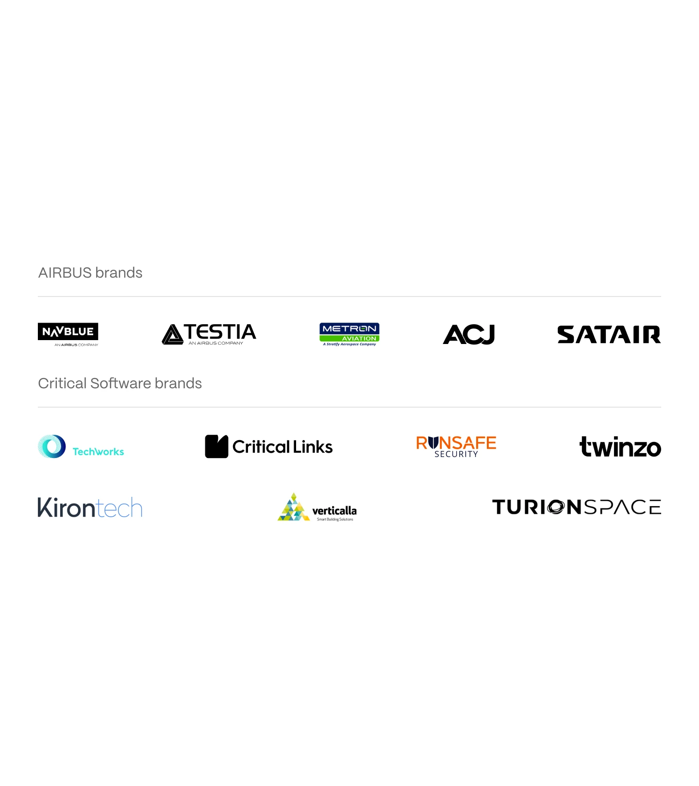
Airbus endorses a family of companies, from NAVBLUE and Testia to Satair and ACJ, and they share a grammar. Typographic, wide, dark, restrained. Critical Software has its own, from Critical Techworks to Turion Space, looser and friendlier.
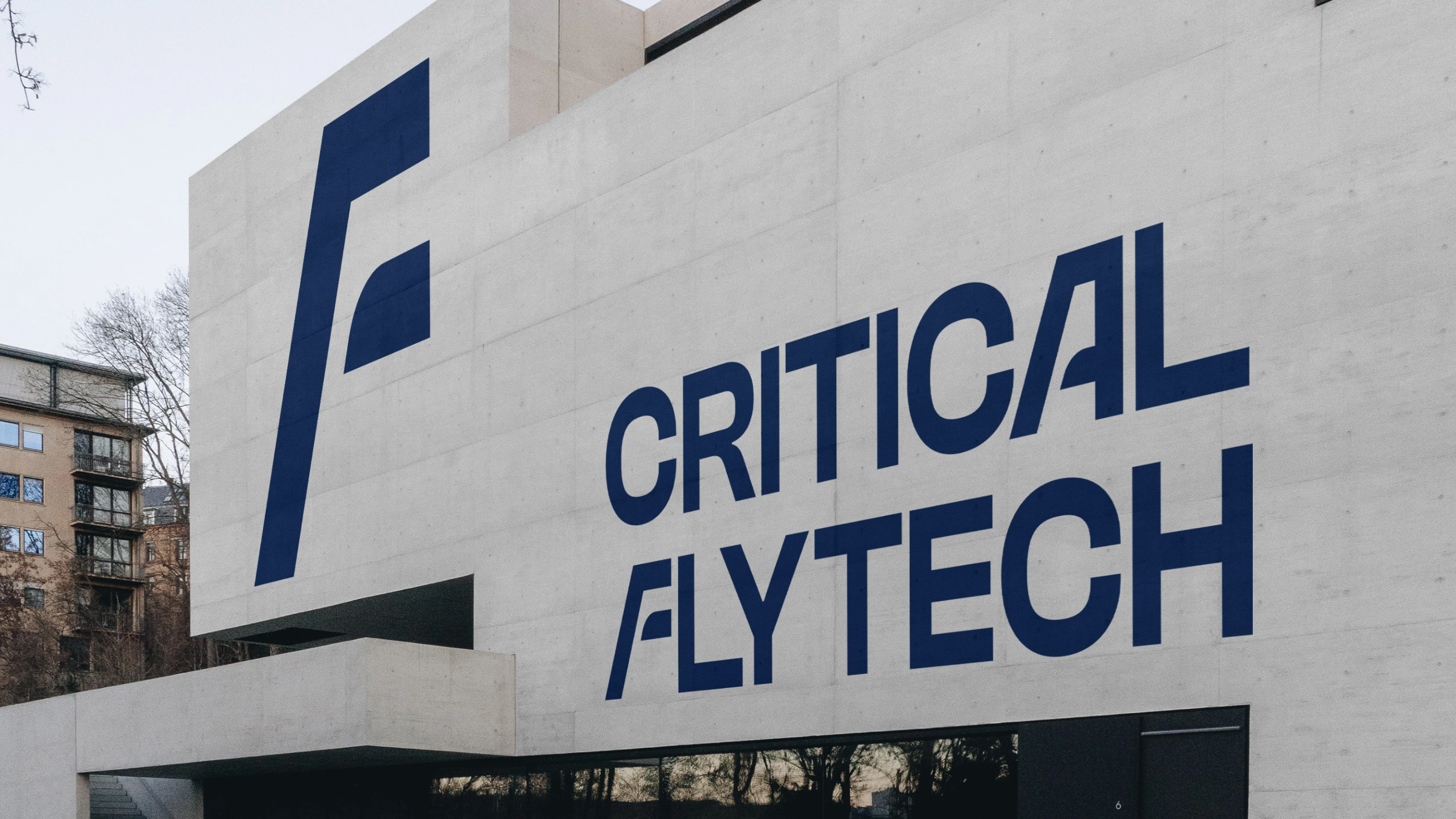
A tagline is a promise about the future. This one needed people to keep it. Less than a year after launch, more than 100 of them work at Critical Flytech.