Sensei
Retail that feels right and runs better
Sensei is a software company building technology for retail experiences. They create solutions perfectly aligned with their clients' businesses, but more importantly, they create experiences. With a future-focused vision and a long-term mindset, Sensei isn’t just thinking about what retail is today, but where it’s going next.
The brief
Our mission was to design a new website based on Sensei’s developed brand identity, created internally by Rui Minchago, their Creative Manager. We worked closely with Rui to bring that brand to life on the web, turning strategy and visuals into an experience that feels as smart as the product itself.
The big challenge? Translating a complex tech platform—serving multiple industries and use cases—into a website that feels clear, intuitive, and genuinely engaging.
The thinking
We kicked things off with a discovery phase focused on Sensei’s market and core purpose: simplifying and personalizing the shopping experience alongside retailers.
From there, we landed on a central idea: the autonomous experience.
Sensei enables a seamless, human-centered journey, one that’s efficient, innovative, and quietly powerful. The Sensei experience itself serves as the guide, helping retailers achieve smarter operations and better customer experiences.
This led us to a clear design direction. Every decision had to pass a simple test: does it feel knowledgeable, visionary, and efficient?
The solution
We designed a website that feels seamless, serene, smart, and beautifully symmetrical.
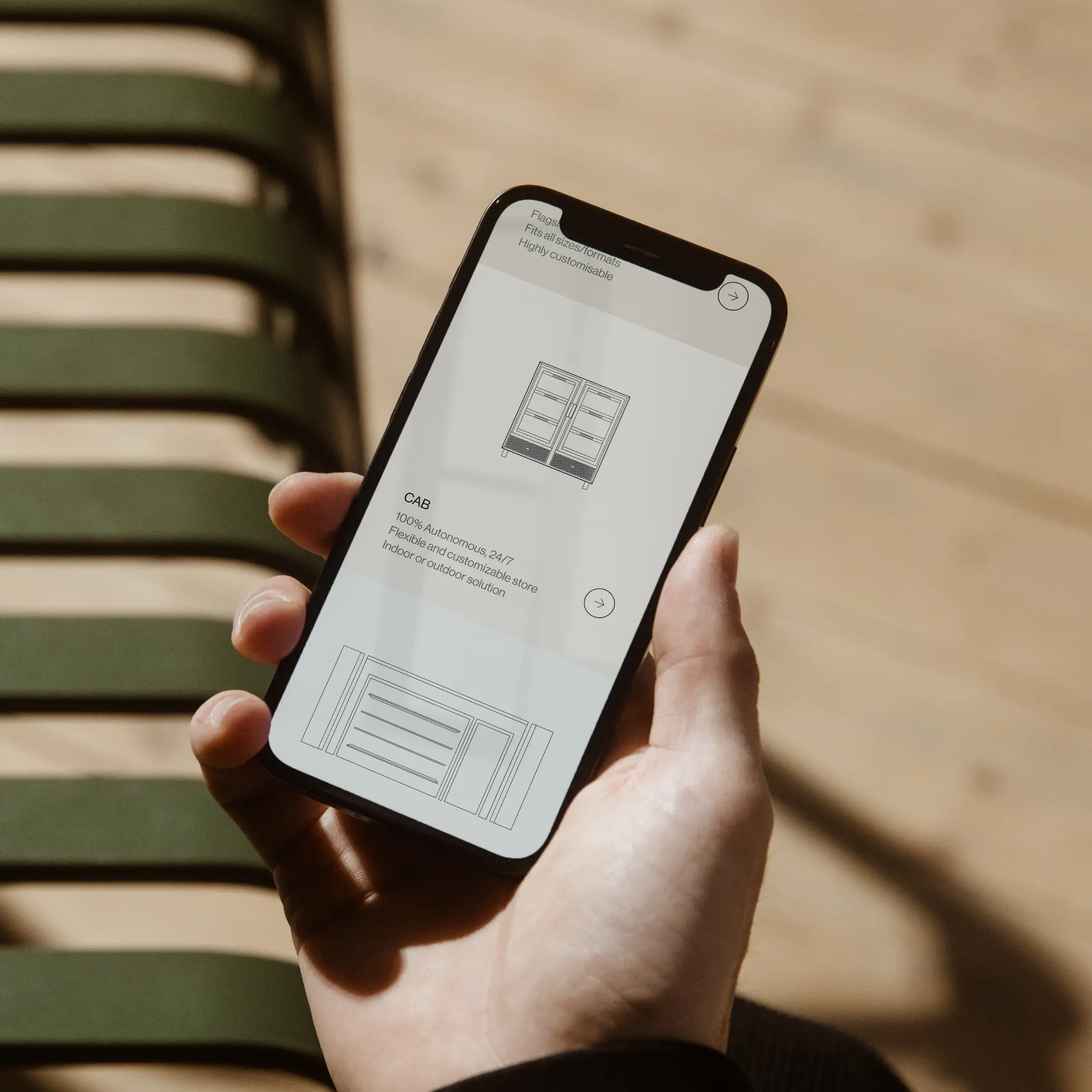
The hero sections act as gateways, less about explaining everything upfront, more about capturing what it feels like to own a Sensei solution. Minimal text, strong visuals, and a clear focus on experience over noise.
The layout creates a smooth visual flow between sections, subtly showcasing the product without overwhelming the user. Full-screen moments highlight individual solutions while naturally inviting exploration. Users can navigate content by industry or by solution, without extra clicks or menu-hunting. Because nobody likes menu-hunting.
Motion plays a quiet but important role. Scroll-based interactions and subtle animations bring the interface to life, helping users feel closer to the Sensei experience as they move through the site.
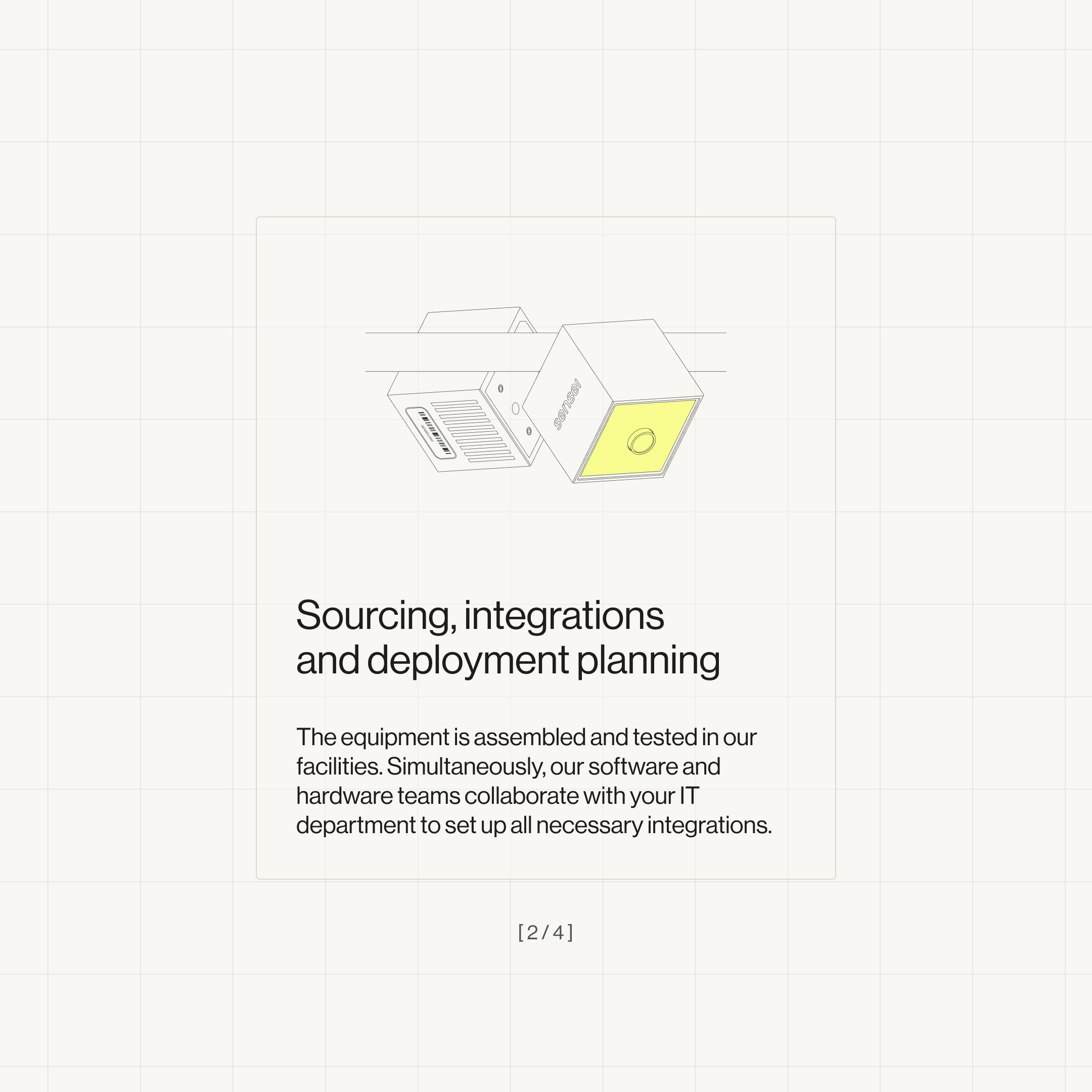
We also added moments of detail, small narrative beats that help retailers understand exactly what they’re getting. Clear feature explanations, paired with engaging visuals, make the technology easier to grasp and more compelling.
To lean into Sensei’s technical DNA, we used isometric views and system details. These elements offer a deeper, more technical look at the product, perfect for users who want to zoom in and really understand how it works.
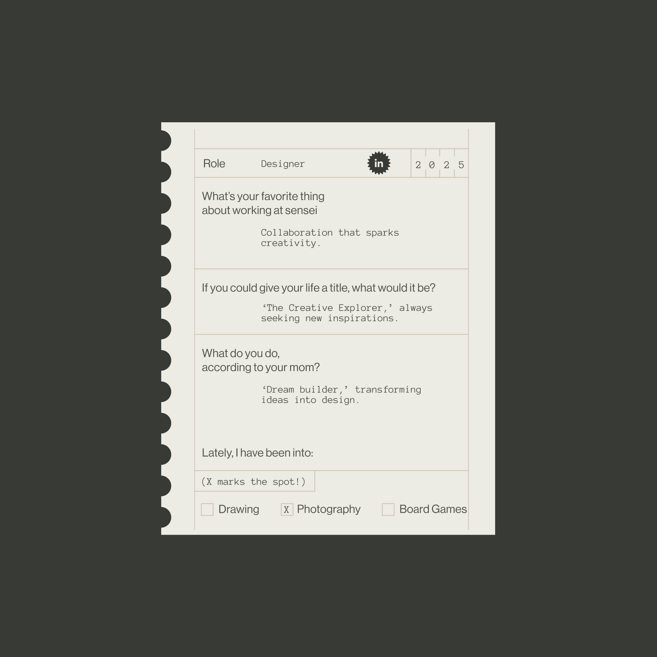
And because no great product exists without great people, the culture & team page shines a light on Sensei’s values and the humans behind the tech. Real moments, real teams, and a glimpse into what it’s like to build the future of retail from the inside.
The result
In the end, we delivered a website that unfolds through scrolling, guiding users step by step through how Sensei is changing the way we shop. Clear, confident, and quietly ambitious. Just like Sensei.
We designed a website that feels seamless, serene, smart and beautifully symmetrical.