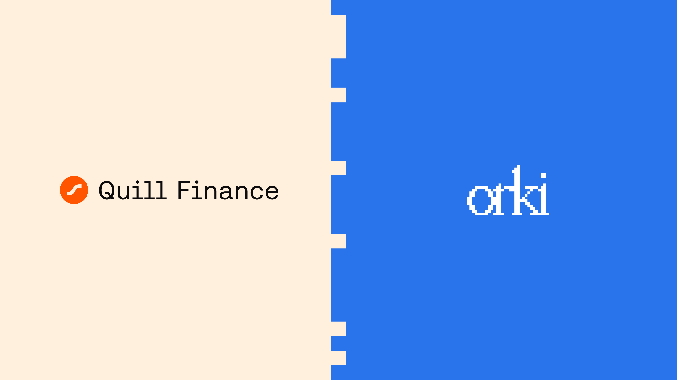
Quill & Orki
Two brands, one codebase
Subvisual builds products and the companies behind them.
They were building a native stablecoin for Scroll. Halfway through, Swell asked for one too. Same architecture, same technical spine, both built on Liquity V2. The second product's code was forked from the first.
Underneath, these were near enough the same thing. Above, they could not be.
Stablecoins do not live on websites. They live inside ecosystems, and every ecosystem has its own temperature and its own people. A brand that felt native to one would feel borrowed in the other.
On the product side, reuse was the whole advantage. Patterns that worked on the first product shipped faster on the second. On the brand side we did the opposite. We ran the method again from the start and let it take us somewhere else.
Quill, on Scroll
Quill arrived already named.
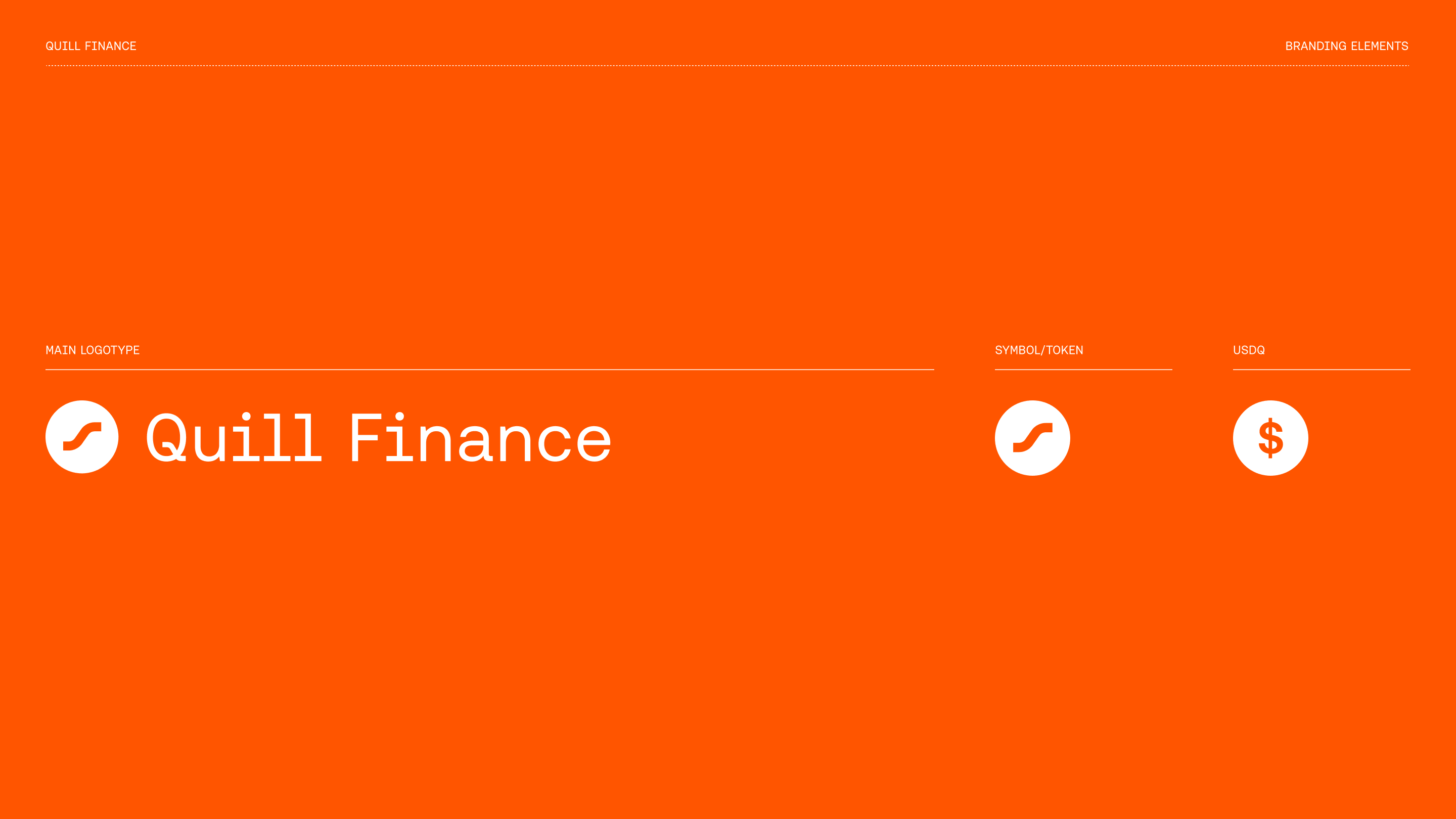
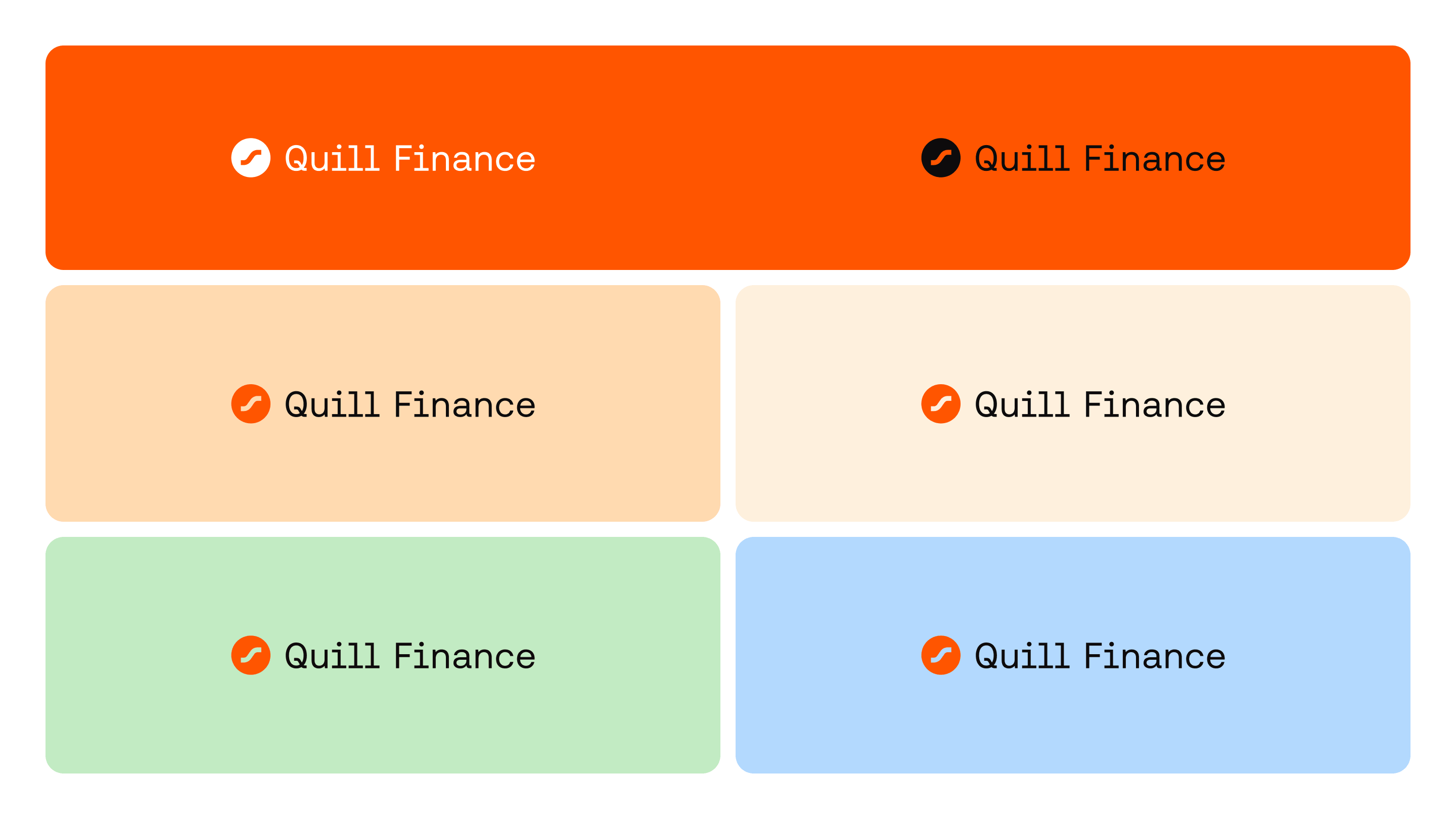
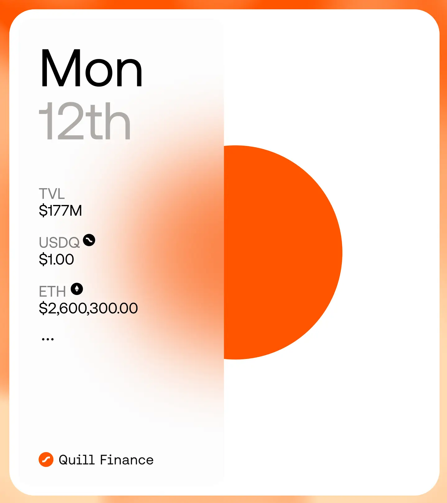
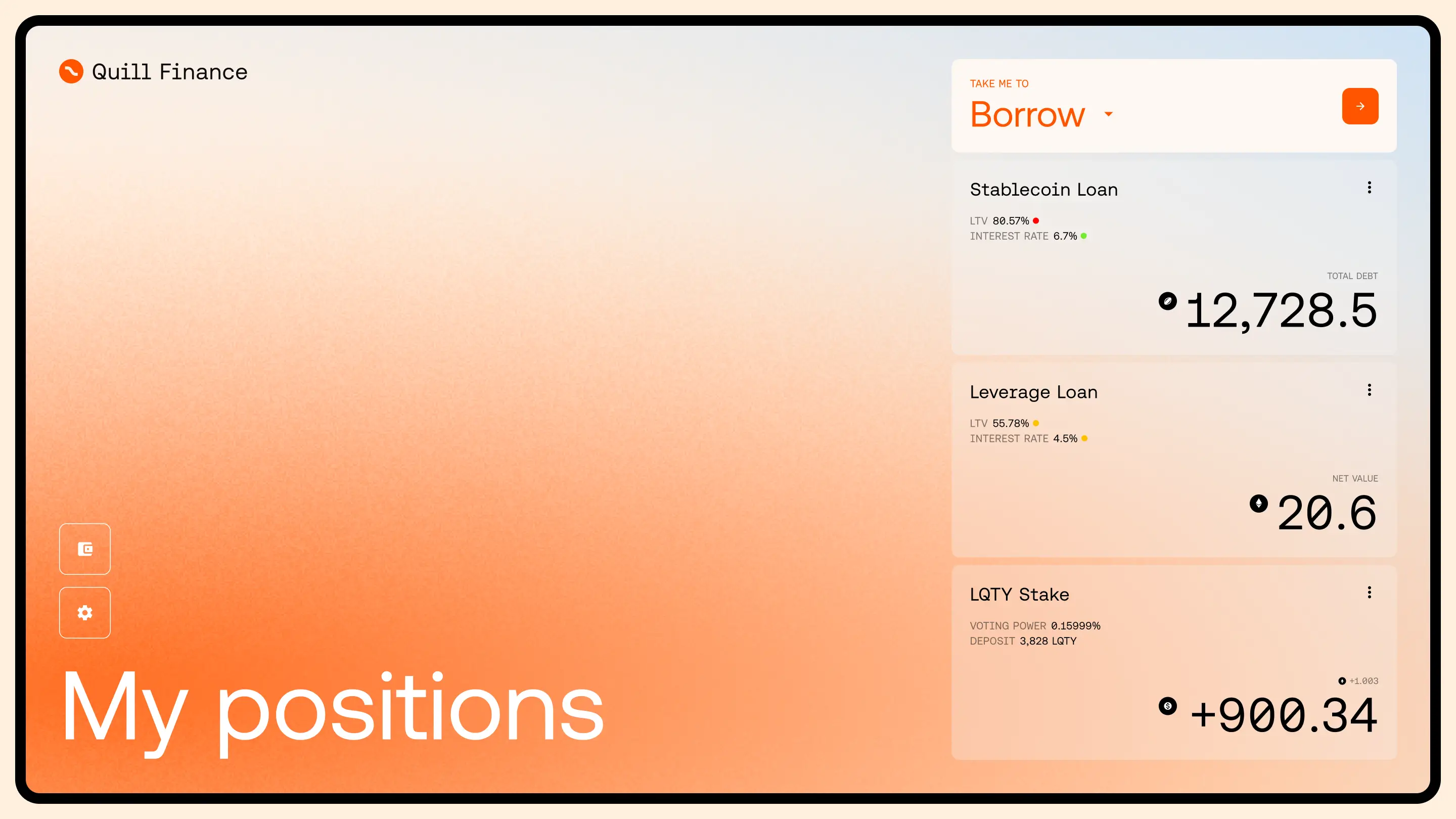
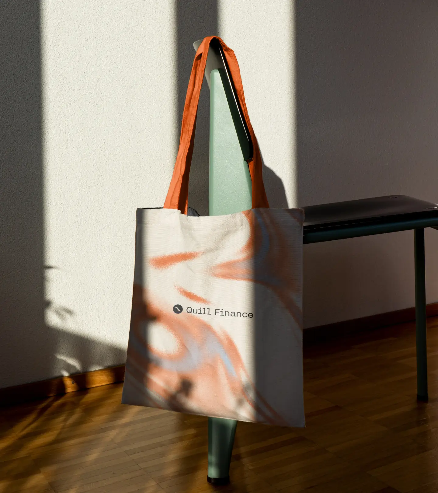
The name was doing work before we opened a file. Scroll, parchment, ink, a pen. We followed it instead of fighting it and built a world that feels made by hand. Warm paper tones. A single orange that behaves like ink on a page. Black type with room around it. The imagery is tactile, stones and soft grain, things you could pick up and turn over.
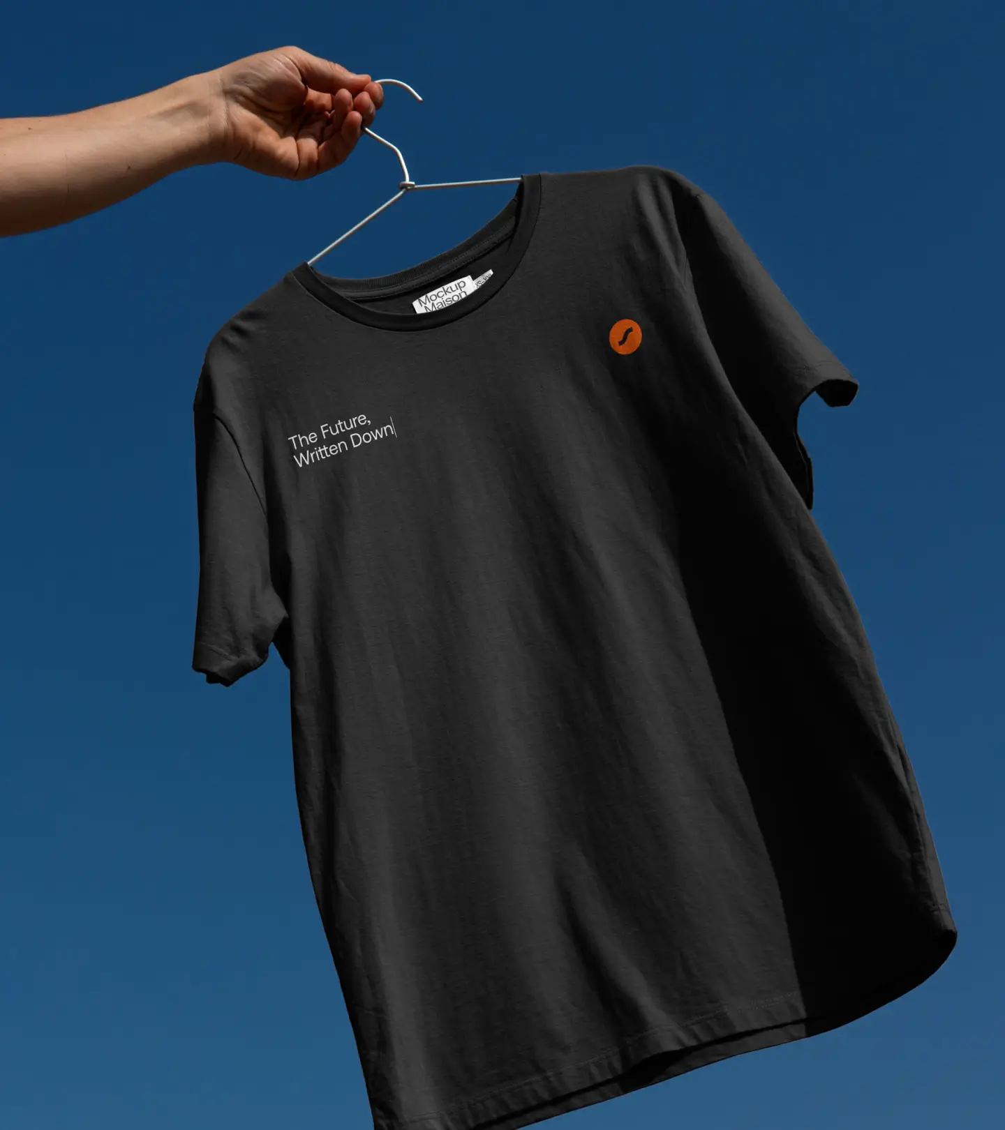
The line we landed on was The Future, Written Down.
Everything is deliberate. Calm hierarchy, clarity over drama. It is a financial protocol on a zk-rollup and it reads like something considered rather than something shouted.
Orki, on Swell
Orki we named.
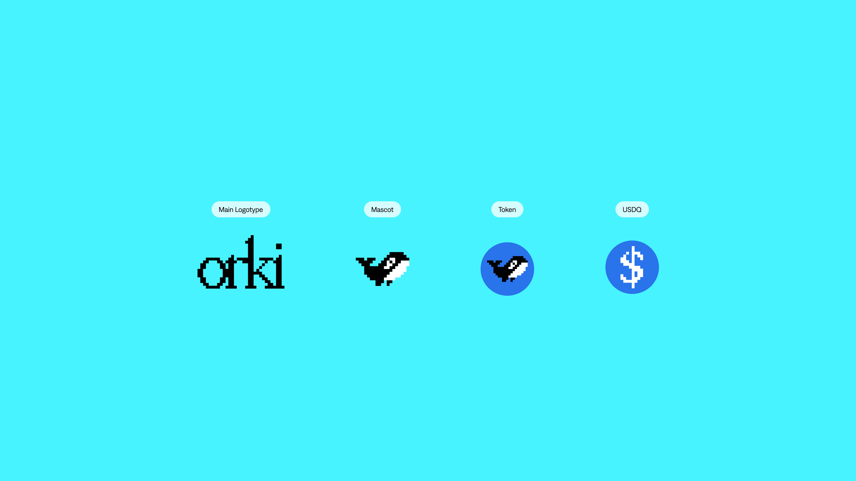
Swell is a wave, so we followed the water. But the orca was never a pun on the ocean. It was an argument and every part of it had a job.
An orca leads its ecosystem without owning it, which is exactly what a stablecoin does alongside Swell's staking. It hunts by intelligence and coordination rather than force, which is what the engineering underneath actually looks like. It moves in pods, which is the interoperability story with Swell and the wider DeFi space. And it masters the deep, which here is barely a metaphor at all. The deep is where the liquidity is.
Four traits, four things the brand had to say. That is when we knew the name would hold.
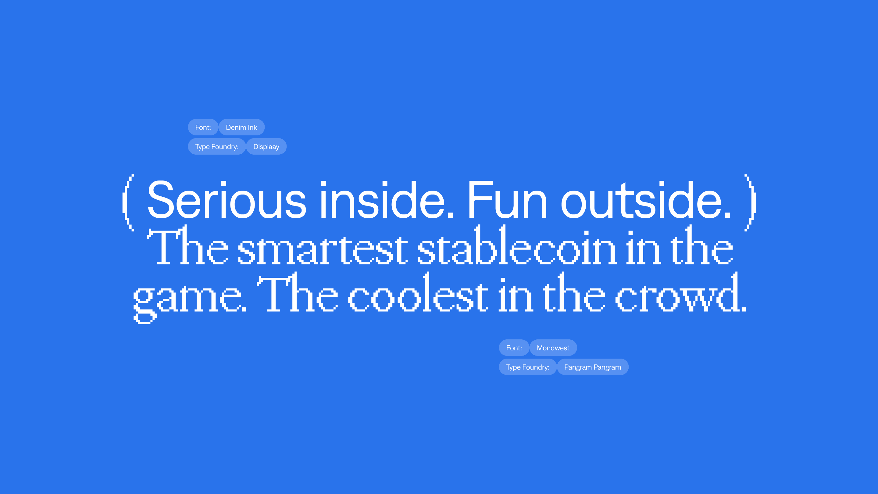
Confident, curious, quick, never silly about the money. The palette went the other way from Quill entirely. Electric cyan and deep blue against black. Glossy where Quill is matte, lit where Quill is warm, fast where Quill is measured.
Same rigour. Different voice.
The proof is the method
Put the two side by side and nothing gives them away as siblings. Not the colour, not the typography, not the tone, not the way either site moves. You would not guess they were made by the same studio, from the same codebase, for the same client.
What repeats is never the look. It is the method.
Understand the room the brand has to live in and what the people already in it respond to. Find the idea sitting inside the name, or go and find the name. Test it against everything the product needs to say, and keep it only if it carries all of it. Then build outward until every decision has a reason that belongs to this brand and to no other.
Run that on the same product twice and you get two answers.
We don't have a signature style. We have a signature method.
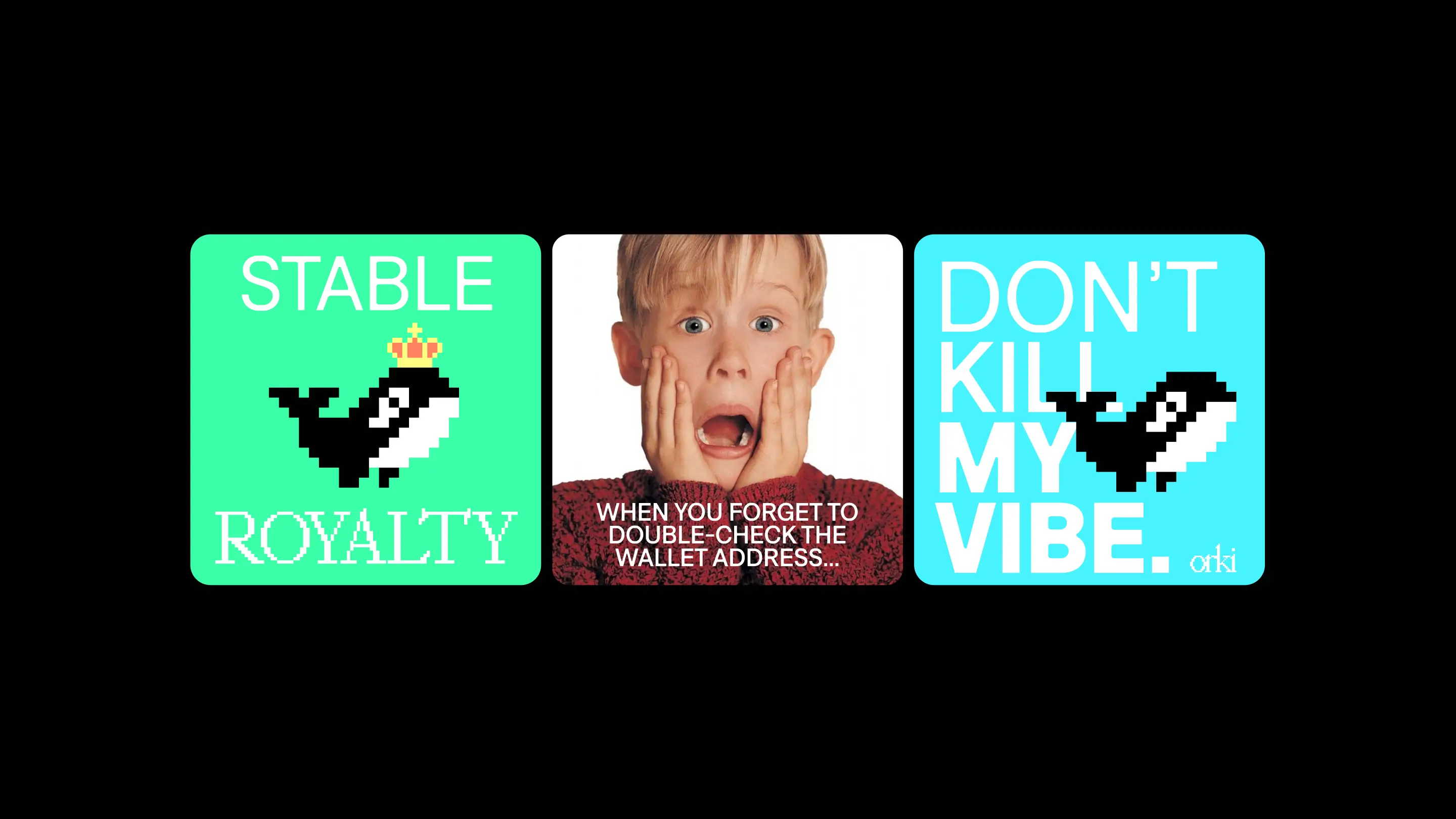
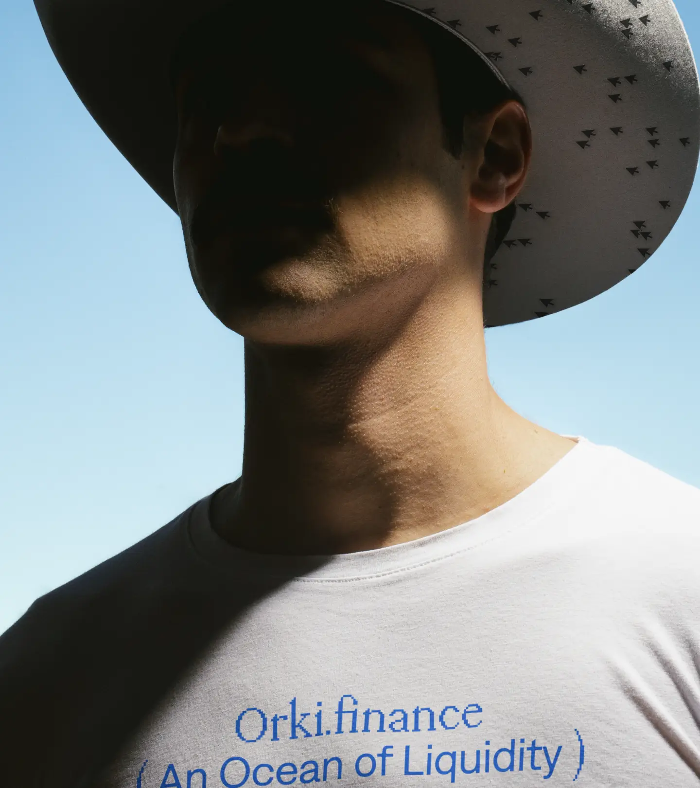
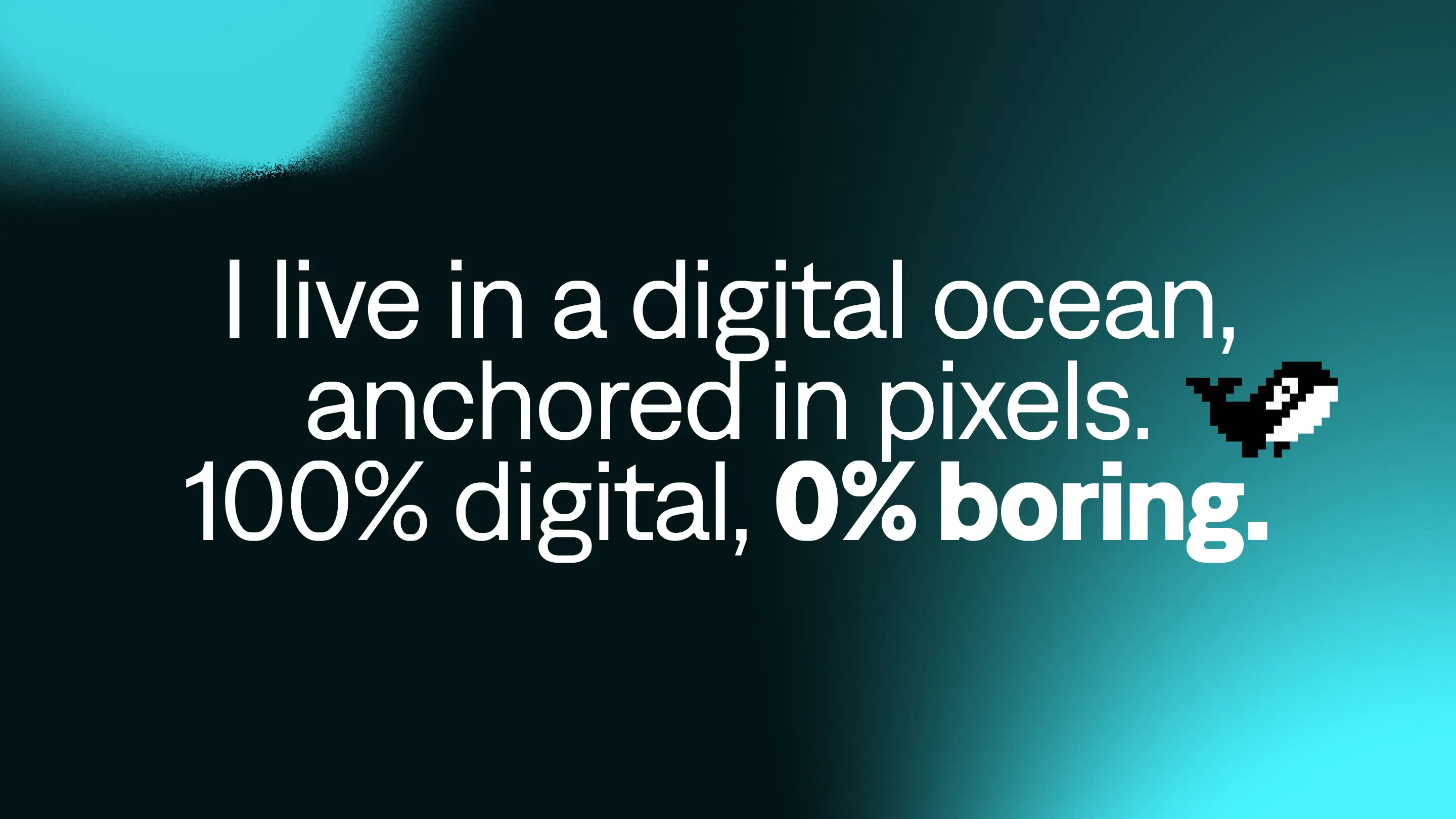
Then the character started talking. The whole brand speaks in the first person.
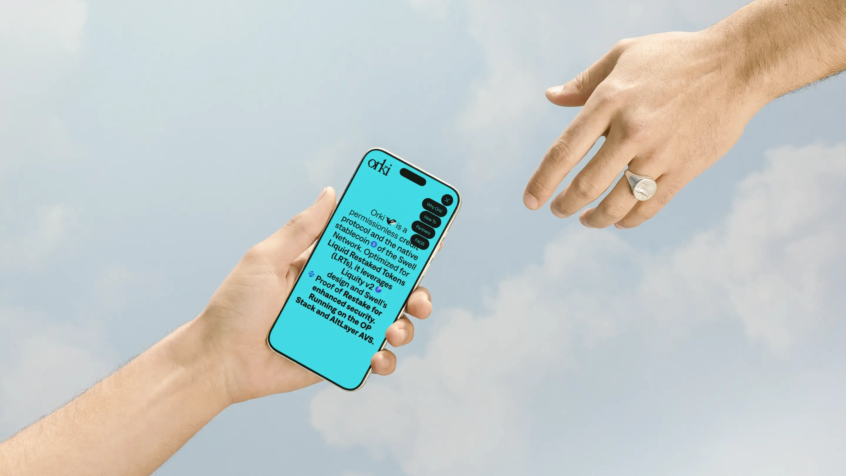
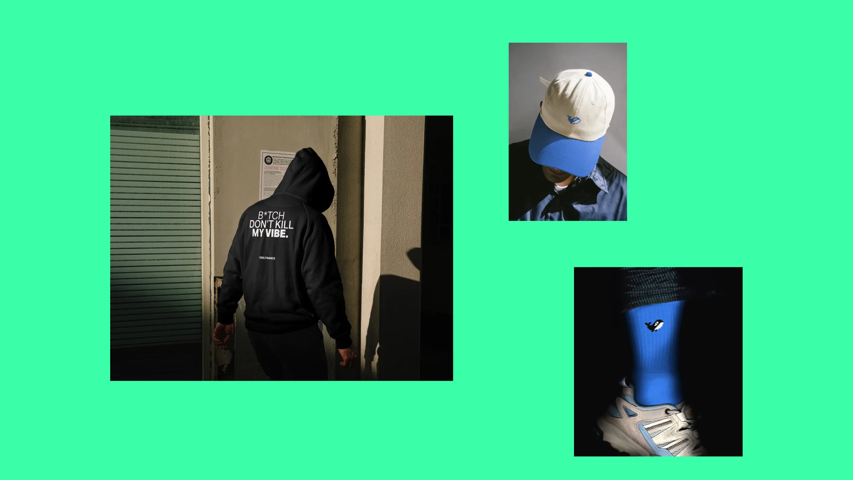
Put the two side by side and nothing gives them away as siblings.
Not the colour, not the typography, not the tone, not the way either site moves. You would not guess they were made by the same studio, from the same codebase, for the same client.