Modern Tax
Starting with a song
First things first — let’s talk about Lisandra, our Lead Designer. She has a bit of a ritual when kicking off a project. Before a single design gets made, she finds a metaphor. It might be a song that captures the brand’s energy, a video clip that mirrors the goal for the the aesthetic we aim to build, or even a weird scientific phenomenon, like cells that behave the same way a team does. It’s usually something unexpected, but always deeply intentional. Something in the rhythm, aesthetic, or behavior reflects the brand’s vision, values, purpose, or personality.
Whatever form it takes, it becomes our creative north star — guiding not just the brand identity, but how that identity comes to life across every touchpoint: website, product, social, merch, and every digital or physical experience in between.
For Modern, the metaphor was a song: "GO CRAZY, GO STOOPID" by Safario & Lokoy. It’s chaotic in the best way — wild, fun, and buzzing with high-energy optimism. That contagious beat became our unofficial soundtrack. It reminded us that this brand needed to be vibrant, full of movement, and never boring. The punchy, bass-heavy instrumental also kept us grounded — a reminder that even the most joyful brand still has to deliver results.
We played it on repeat. We danced. And we sketched hundreds of smiley M’s until we found the perfect one. Because yeah, we take branding seriously. But we also believe it should have a pulse.
So go ahead — hit play. And come with us through the process of building the new Modern.
More than a tax firm
Modern helps companies save a lot of money on their taxes. But unlike the typical cold, grey-suit tax firm, they do it with empathy, strategy, and a human-first approach. Picture a team full of proactive minds that leads with strategy, builds real relationships, and makes sure their clients see the money come back where it belongs.
When they came to us, they were feeling stuck. Their brand didn’t reflect who they really were. The website felt flat — like it had been built from the same cookie-cutter template every other tax firm was using. Same colors, same layout, same safe vibe. And while their team was out there building meaningful client relationships and delivering real financial impact, their identity wasn’t keeping up. They needed more than a visual refresh — they needed a whole new experience that told the world: ****we’re not like the others.
So we dug in. And the more we listened, the more it became clear — this wasn’t just a tax firm. This was a team of financial allies, powered by curiosity, empathy, and serious brains. They weren’t just crunching numbers. They were building trust. Problem-solving. Partnering with companies to help them grow, evolve, and win. That’s a story worth telling — and definitely worth a bold rebrand.
Designing with feeling
Now, humanizing taxes isn’t the easiest brief. It’s kind of like asking someone to make spreadsheets feel cozy. But we saw it as an opportunity to rethink everything — tone, visuals, colors, structure, even the way conversations happen between firm and client.
We started by reshaping the narrative. No jargon. No fluff. Just a clear, open, and honest tone that felt like a conversation with someone you actually trust. We built a story around empathy, transparency, and financial empowerment — all backed by experience and strategy. Modern became a brand that doesn’t talk at you, it talks with you.
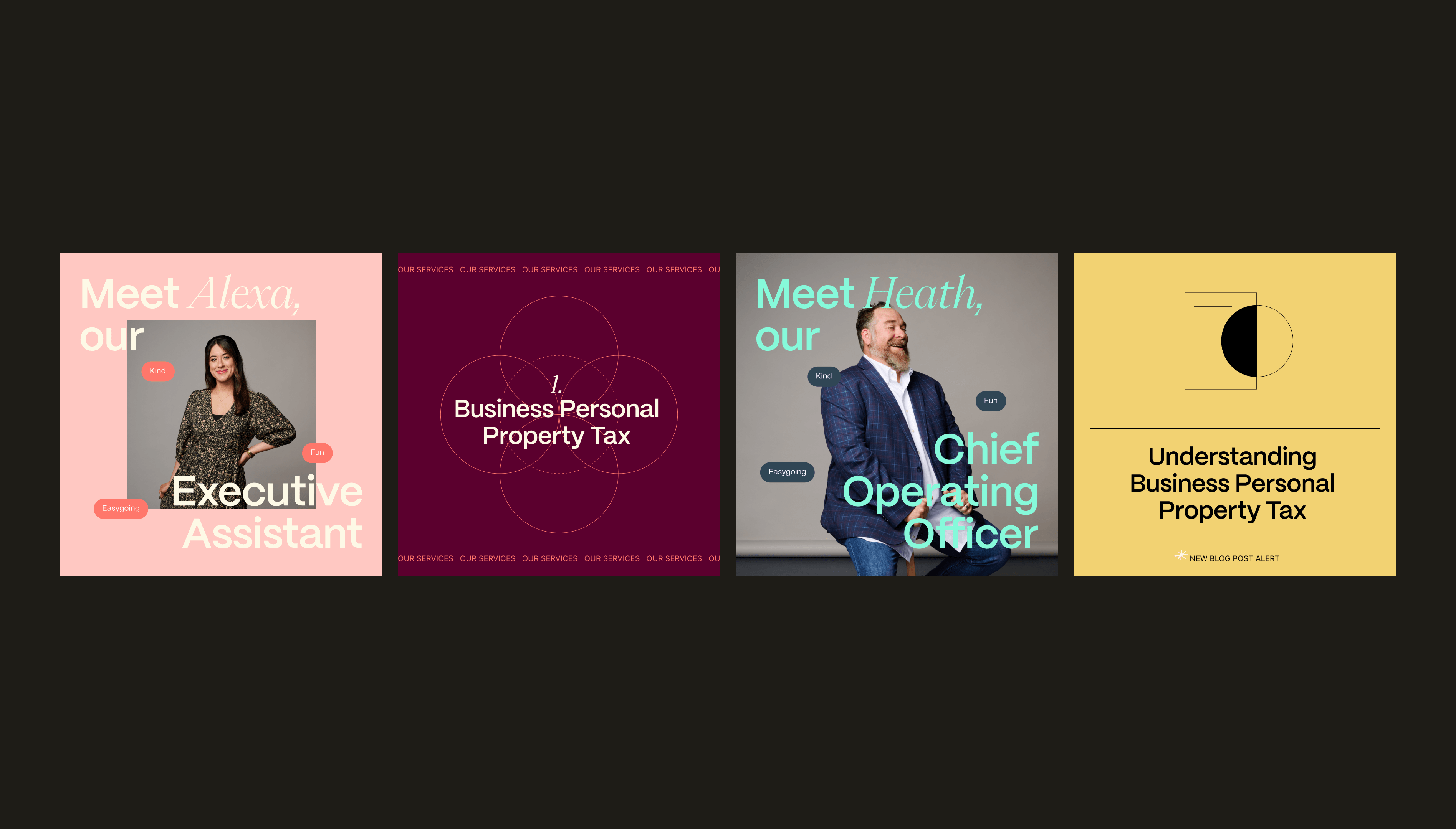
Then came the visual identity. The usual tax firm colors — navy, grey, black — were politely shown the door. Instead, we introduced a palette that felt warm, unique, and alive. Soft, optimistic tones paired with strong accents to reflect both sides of Modern’s personality: kind and capable. Our typography choices followed suit — clean and customized with subtle quirks that brought out the brand’s human touch.
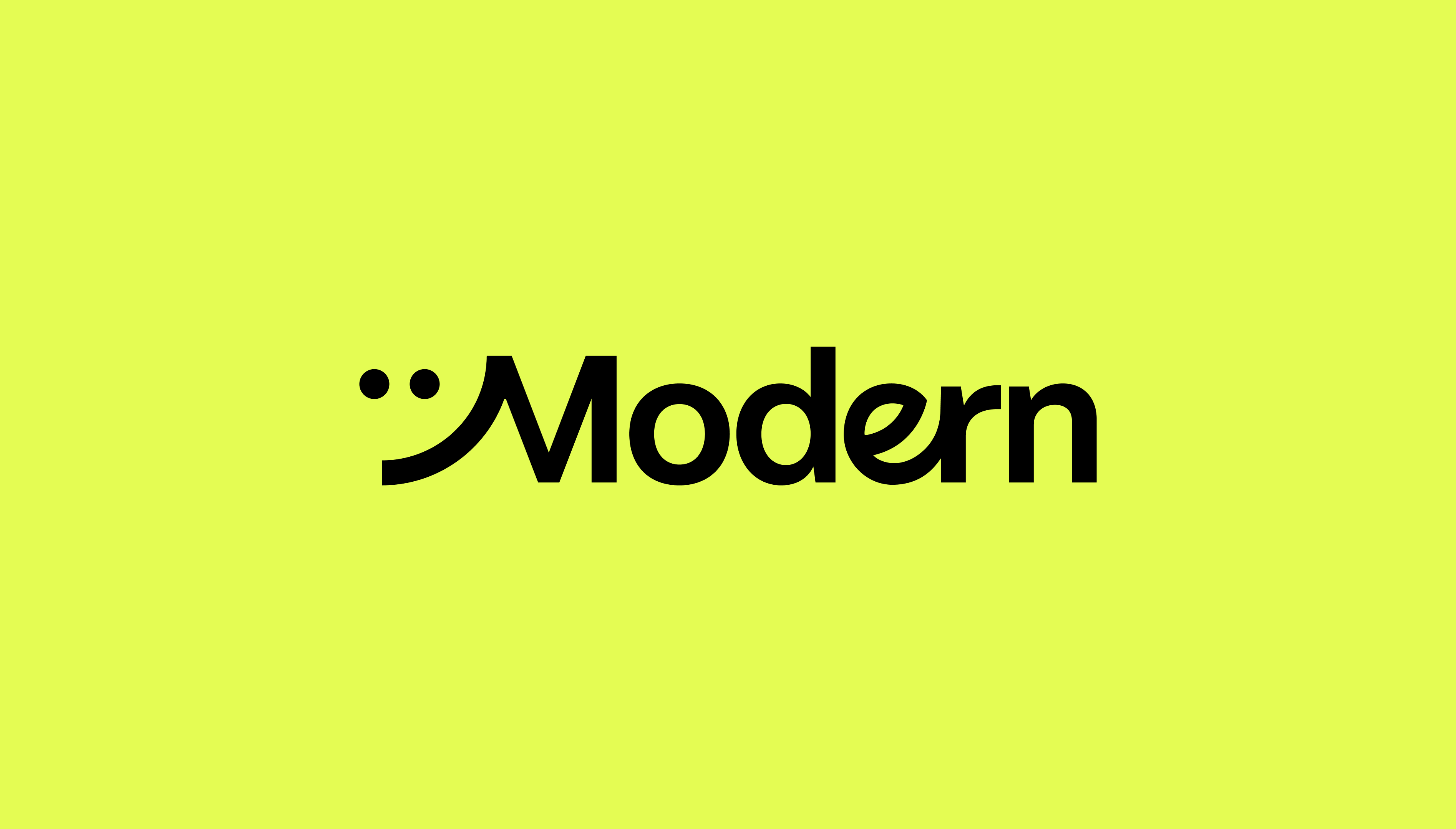
And the logo? Let’s just say we went a little wild. There were hundreds of sketches. Dozens of smiley M’s. Some of them definitely too smiley. But eventually, we landed on the perfect balance — something simple, bold, and full of energy. A mark that stands out in a sea of sameness and makes you feel something.
A site that moves
To bring it fully to life, we collaborated with motion designer Diogo Louro to create an animated version of the logo that now opens the Modern website. It’s a small moment — but it sets the tone instantly: vibrant, human, and just unexpected enough to make you curious. That movement became a metaphor for the brand itself — always evolving, always forward.
Modern’s website came with its own challenge: it needed to deliver a lot of information without losing the fresh, easy energy we built into the brand. So we leaned into animation not just for flair, but for function. Smooth transitions, playful microinteractions, and thoughtful pacing helped us break down dense content into something approachable and clear. It’s a site full of strategy, but wrapped in simplicity — just like Modern.
The result? A brand that breathes. A site that talks. An identity that finally reflects the powerhouse behind the name. Modern isn’t just saving companies money. They’re redefining what a tax firm can feel like.
Empathetic. Proactive. Trustworthy. And yeah — a little unexpected.
Because taxes shouldn’t feel like a root canal. They should feel like someone’s got your back.
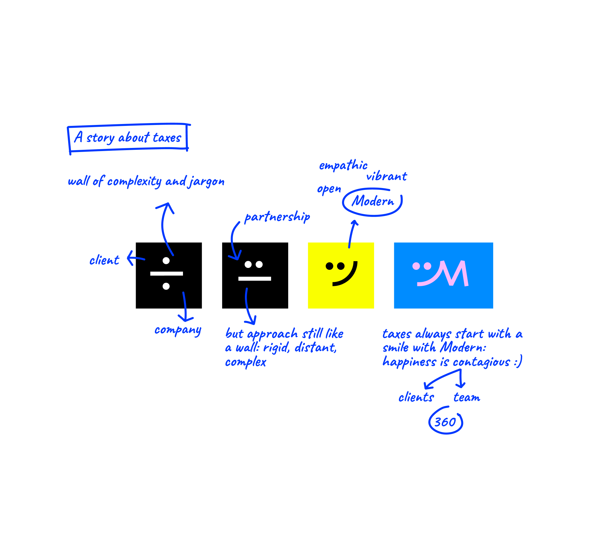
We started by reshaping the narrative. No jargon. No fluff. Just a clear, open, and honest tone that felt like a conversation with someone you actually trust. We built a story around empathy, transparency, and financial empowerment — all backed by experience and strategy. Modern became a brand that doesn’t talk at you, it talks with you.
Soft, optimistic tones paired with strong accents to reflect both sides of Modern’s personality: kind and capable. Our typography choices followed suit — clean and customized with subtle quirks that brought out the brand’s human touch.
We leaned into animation not just for flair, but for function. Smooth transitions, playful microinteractions, and thoughtful pacing helped us break down dense content into something approachable and clear. It’s a site full of strategy, but wrapped in simplicity — just like Modern.
Empathetic. Proactive. Trustworthy. And yeah — a little unexpected. Because taxes shouldn’t feel like a root canal. They should feel like someone’s got your back.