Brilean

Starting over to go further
Atlanse had outgrown its name. What had started as a shared identity with a larger group quickly became its own thing: a focused, close-knit studio building digital products for ambitious companies across Europe, the US and the UAE. But the name stayed, and so did the confusion. Another company called ATLANSE had a consolidated presence online, making the two indistinguishable in search. More than a naming conflict, though, it was a misalignment. Atlanse had become more intentional, more strategic, more partnership-driven than the name ever suggested. It was time for a brand that said who they actually were.
Brilliant ideas, lean execution
Naming is one of the most personal decisions a company can make. There is an emotional weight to it that no brief fully captures. Different people will feel different options in different ways, and no single choice will ever feel entirely obvious to everyone involved. Our role wasn't to hand over a name. It was to help define what the name needed to do: what it should communicate, how it should feel, and what territory it should open up.
The name needed to work in English, Brilean's primary market language, feel purposeful rather than invented and carry something true about how the company actually operates.
Brilean is a constructed word built from two ideas: brilliant and lean. Brilliant in approach: the intelligence and depth brought to every partnership. Lean in execution: the discipline and focus that make the work actually ship. Compact, distinctive and entirely their own. A name that already said something true about how they worked before a single visual was drawn.
The star
With the name grounded, the visual concept had to follow its logic. We weren't designing from scratch. We were giving form to a company that already had a clear character. The challenge was finding a symbol that could hold both sides of Brilean's identity: technically rigorous and genuinely human.
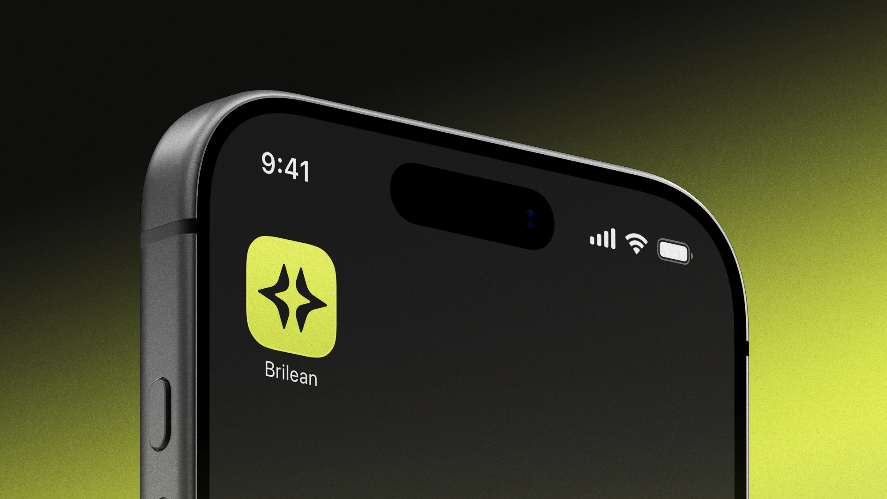
At the heart of the brand lies a star. A timeless, universal symbol, chosen precisely for what it carries. Stars represent guidance and direction: a constant source of clarity and light, especially in moments of uncertainty. For a studio that positions itself as a partner navigating complexity alongside its clients, that meaning is direct and earned. Stars also speak to the pursuit of something greater: the dedication, resilience, and continuous improvement that serious product work demands.
The monogram translates this into form. The creation of a star mirrors the essence of how Brilean works: different forces converging, ideas and perspectives and experiences fusing together to spark something new. Fusion, not friction. Building together, not simply delivering. Each collaboration becomes greater than the sum of its parts.
A system built on tension
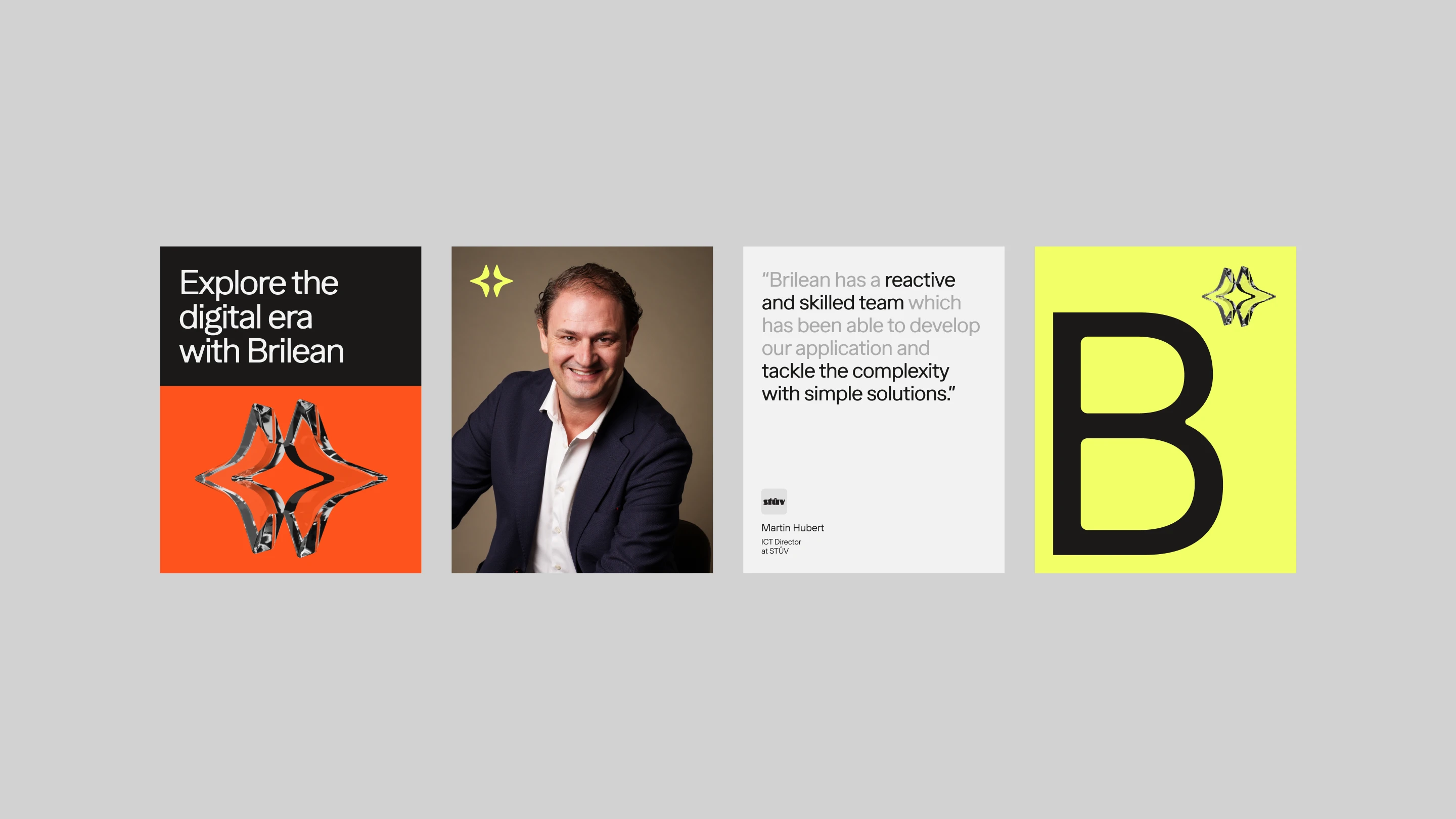
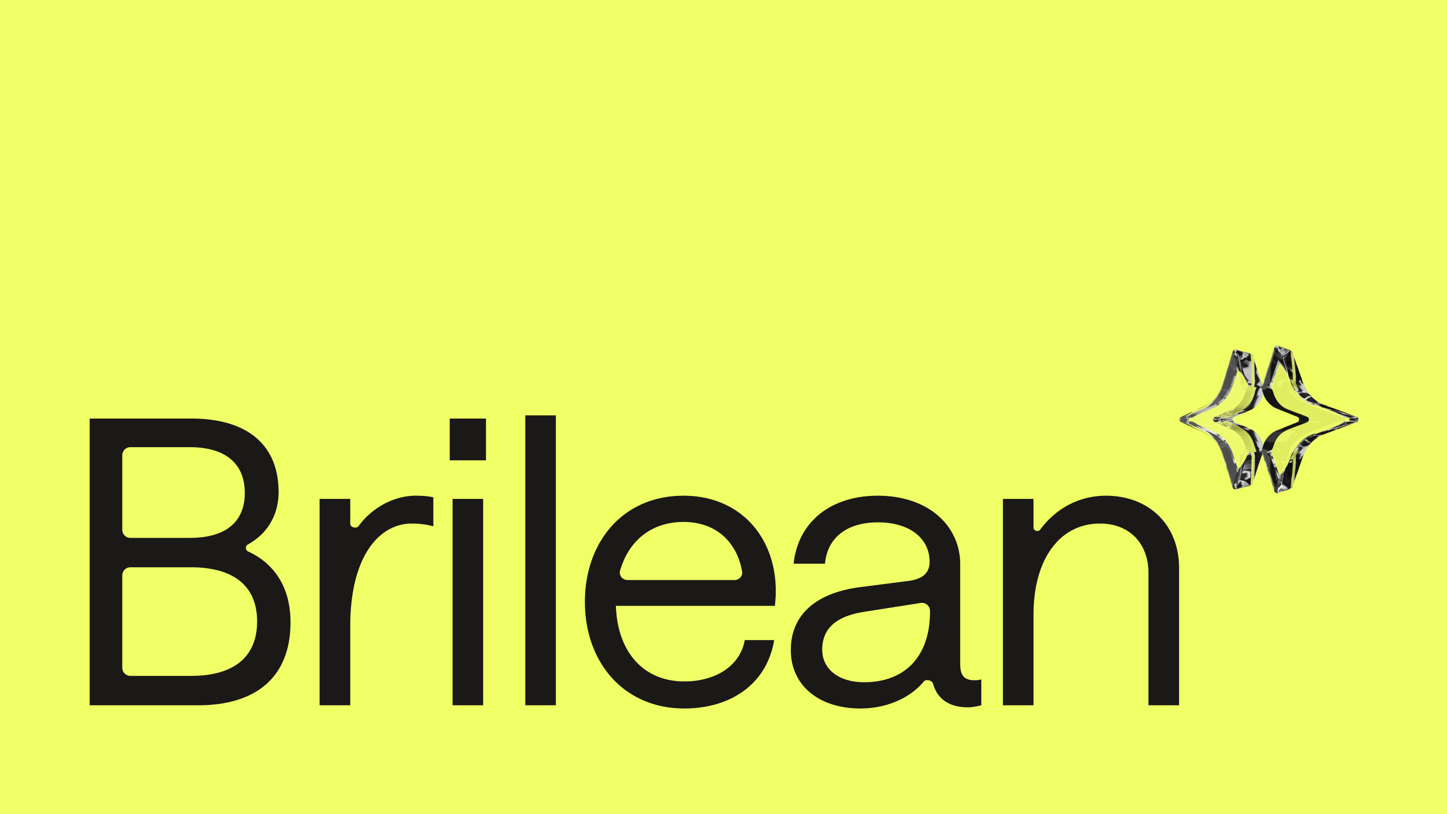
The logo pairs the Brilean wordmark with the star monogram in neon yellow-green, positioned in the upper corner of the mark. Precise, present and deliberately restrained.
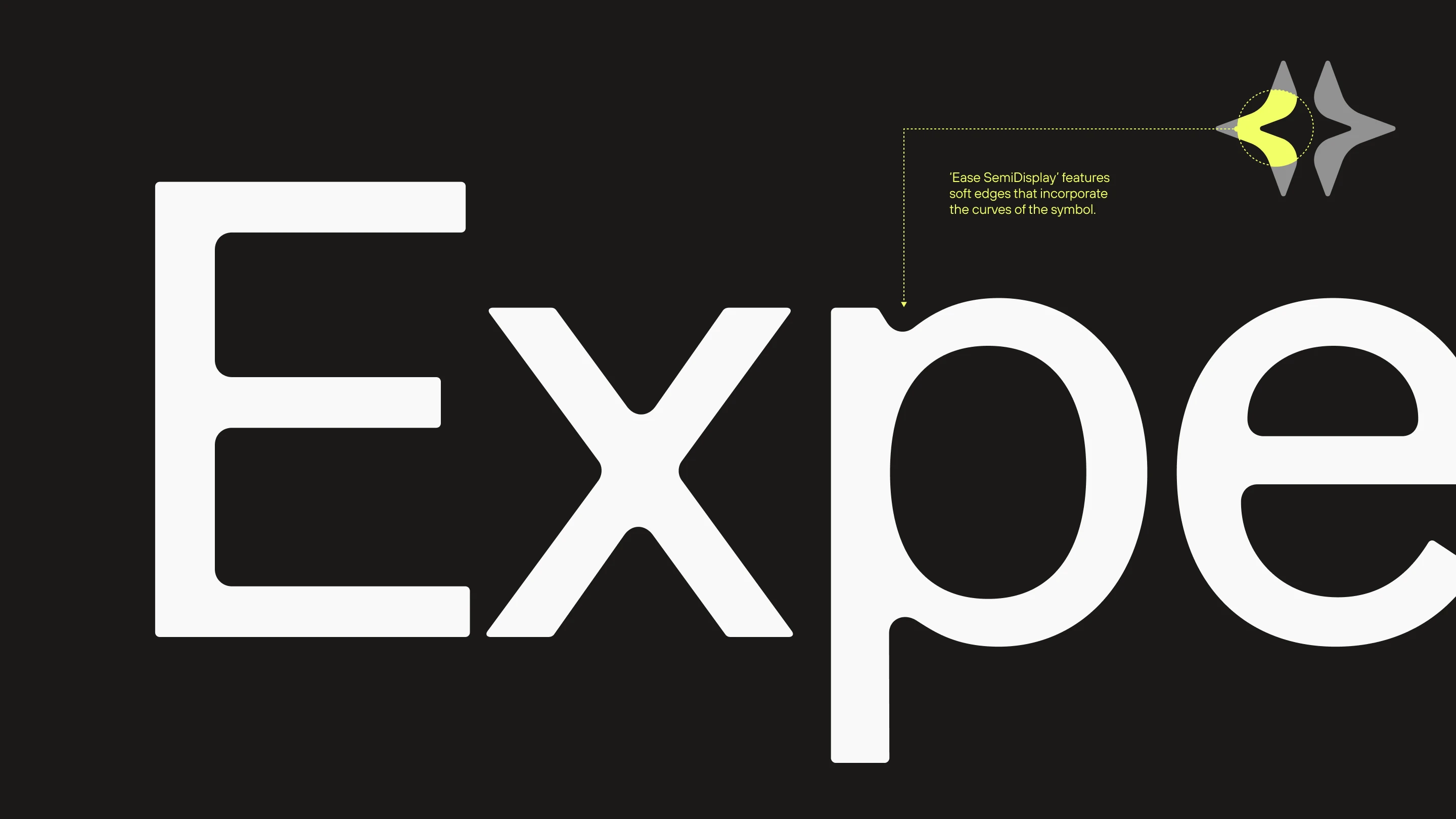
The typography was designed around a deliberate tension. Ease SemiDisplay is the primary typeface: soft-edged, with curves that echo the monogram's. The relationship between letterform and symbol isn't decorative. The typeface was chosen specifically because its character mirrors the warmth Brilean wanted to project. Set alongside TT Hoves Pro, sharper and more technical in nature, the system moves between two registers: human and technological, approachable and rigorous.
The color palette follows the same structure. Black and a range of grays form the neutral, technically credible foundation. Orange and electric yellow act as warm accents, used selectively, the way the star uses light. They appear where the brand wants you to look: to signal energy, to mark action, to draw attention to what matters. Together, the warm and cool tones reflect both sides of Brilean: a team that brings human judgment and technical depth in equal measure.
The site
The website was built to carry the brand into the real context where Brilean earns its work: the moment a potential client decides whether to reach out.
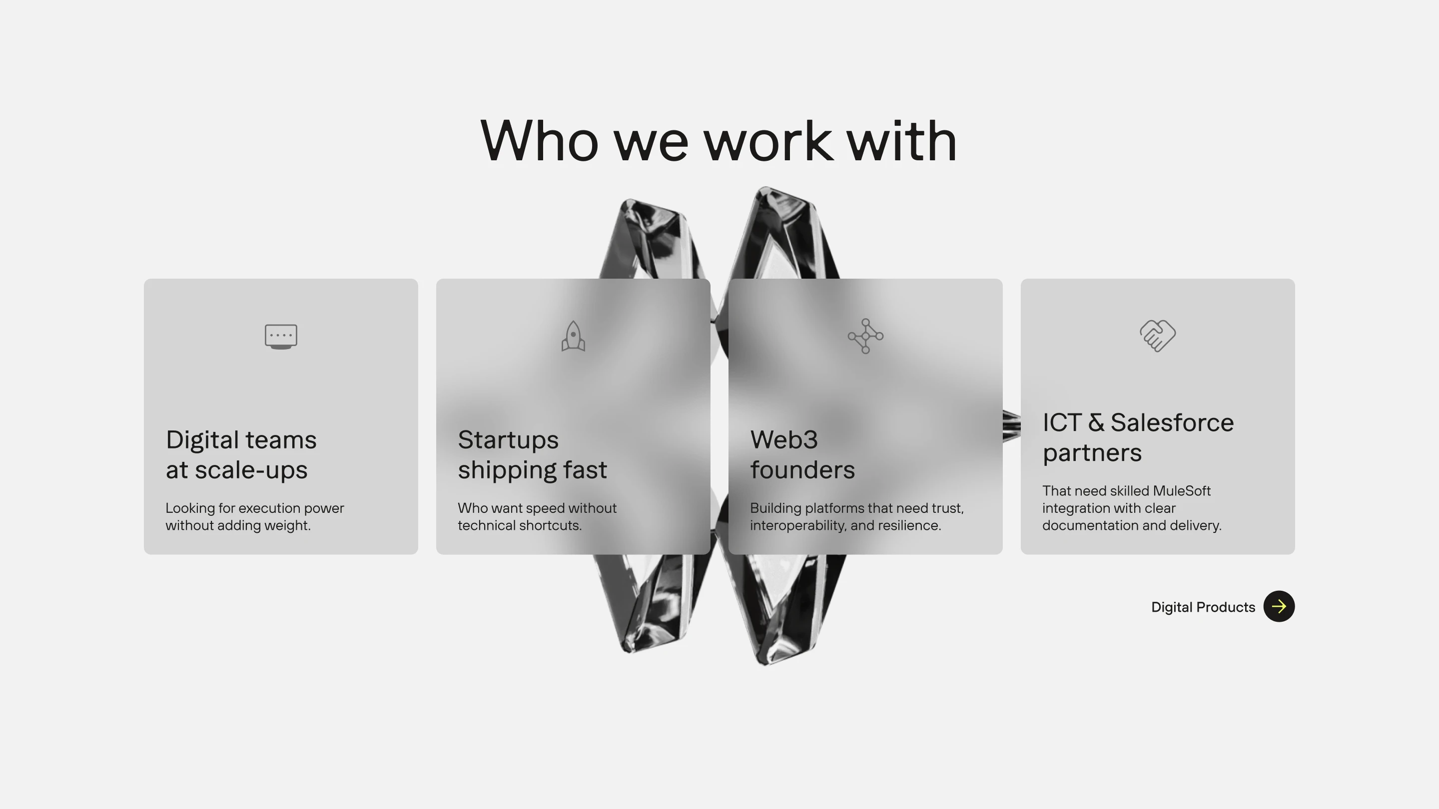
The monogram appears at large scale in the hero, establishing the brand's visual language immediately, before a word is read. The 3D elements, developed by Jéssica Teixeira and Gavin Portillo, bring the identity into a spatial dimension, communicating sophistication and ambition without over-explaining it.
The structure is clear. Two service pillars, Digital Products and MuleSoft, define Brilean. A process section, aligned through design, build and support, shows how they do it. The copy, written by the copywriter João Zamith, was written for the specific people Brilean wants to reach: founders and product teams who've seen enough agency decks to know the difference between a studio that understands their problem and one that's just quoting a brief.
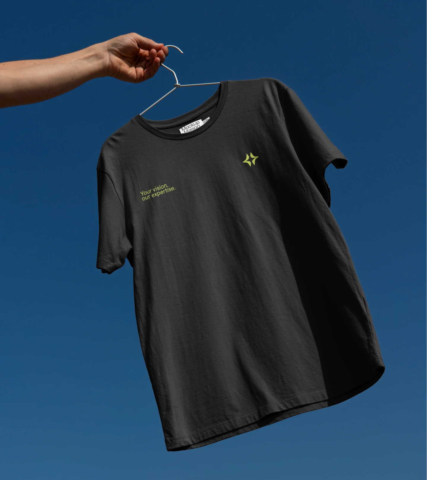
The positioning line that emerged from that process, Your vision, our expertise, became the anchor for everything on the site. It puts the client's goals at the center of the relationship and Brilean's role in the execution. A statement that reflects how the studio actually works, not just how it wants to be seen.
"Every company reaches a moment where growing further means stepping into something bigger. Today, we take that step. What had been confusion became clarity. What had been invisible became presence. A company that had grown beyond its name finally found an identity that matched it.
Your work was decisive in the result we achieved together."
Duarte Vaz, CEO of Brilean