ROB: Revenge of the Body
A fitness boutique for rebels, built from sweat, strategy, and strong branding
When the founders of ROB first came to us, they had an idea raw, bold, and burning with energy.
A new kind of gym. A boutique fitness studio that felt exclusive but not elitist. Fierce but empowering. Stylish, sustainable, and more like a community than a class. But that idea had no name, no face, no identity. Just a big vision: to challenge the traditional fitness experience and make transformation something you crave, not dread.
So, what exactly is ROB?
ROB – Revenge of the Body – is not your typical gym.
It's a boutique fitness space that flips the script. Think smaller, curated classes. No membership chains. A premium, eco-conscious environment where your goals are respected, not shouted at. It's about reclaiming your body, rewriting your narrative, and doing it all with style.
ROB came to us with a clean slate and the ambition to make noise in an oversaturated wellness market.
The challenge
Create an entirely new brand from scratch that feels:
- Visually magnetic and modern
- Emotionally empowering
- Strategically positioned to stand out in the boutique fitness space
- And flexible enough to grow with the business
No pressure, right? ROB wasn't just selling workouts; it was selling a mindset shift.
But how do you package something that personal, that powerful?
The strategic approach
We started by digging deep and understanding the psychology of the ROB audience.
These weren't just gym-goers. They were people who wanted change. People who may not have felt seen in traditional fitness spaces. People looking for a space that feels tailored, respectful, motivating, and most of all real.
From there, the identity began to take shape.
The brand name & narrative
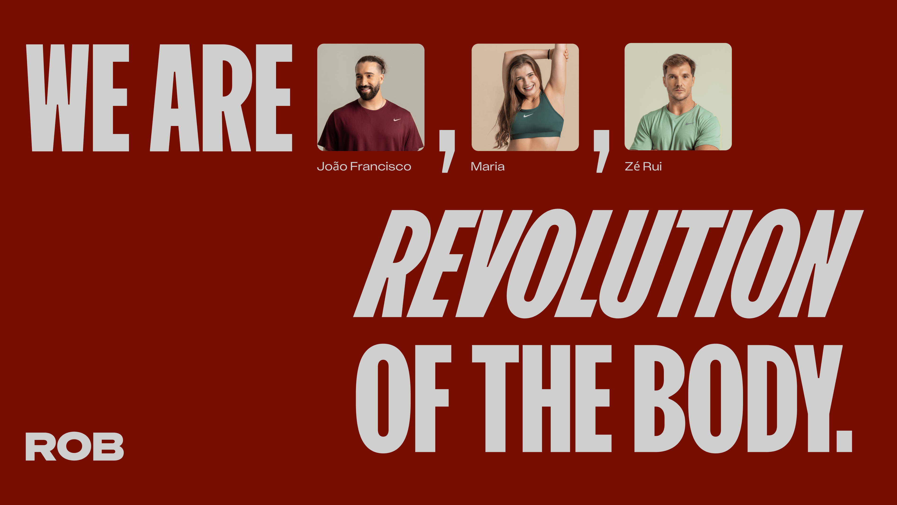
"Revenge of the Body" isn't just a name. It's a bold statement.
A little provocative, a little rebellious, and impossible to ignore. It speaks to that internal fire. The need to come back stronger. To reclaim. To transform.
It was the perfect blend of attitude, aspiration, and the kind of name the industry hadn't seen before.
Visual identity
ROB needed to look powerful, without being overwhelming.
We built a visual world around motion, muscle, and momentum, because transformation isn't static.
The logo plays with forward motion and symmetry, symbolizing the push and pull of change. It's confident. Geometric. Clean.
We paired it with a punchy, energetic color palette, warm and vibrant tones that reflect the high-intensity workouts and the brand's human energy. It's not cold or techy. It's alive, bold, and full of drive.
Typography? Strong and modern, with just enough edge to say, "We mean business," while maintaining balance. Using all caps brings impact and confidence, without tipping into aggression, an intentional choice to reflect the brand's unapologetic stance.
Tone of voice
ROB's voice was just as important as its look.
It had to sound like a coach you want to hear from, empowering, inclusive, and slightly cheeky.
Think: "You got this" energy, but with style. Not just motivational, but meaningful. The kind of tone that builds trust without ever sounding like a cliché.
From concept to experience
We didn't stop at logo and colors. The brand had to live and breathe across every touchpoint:
Website
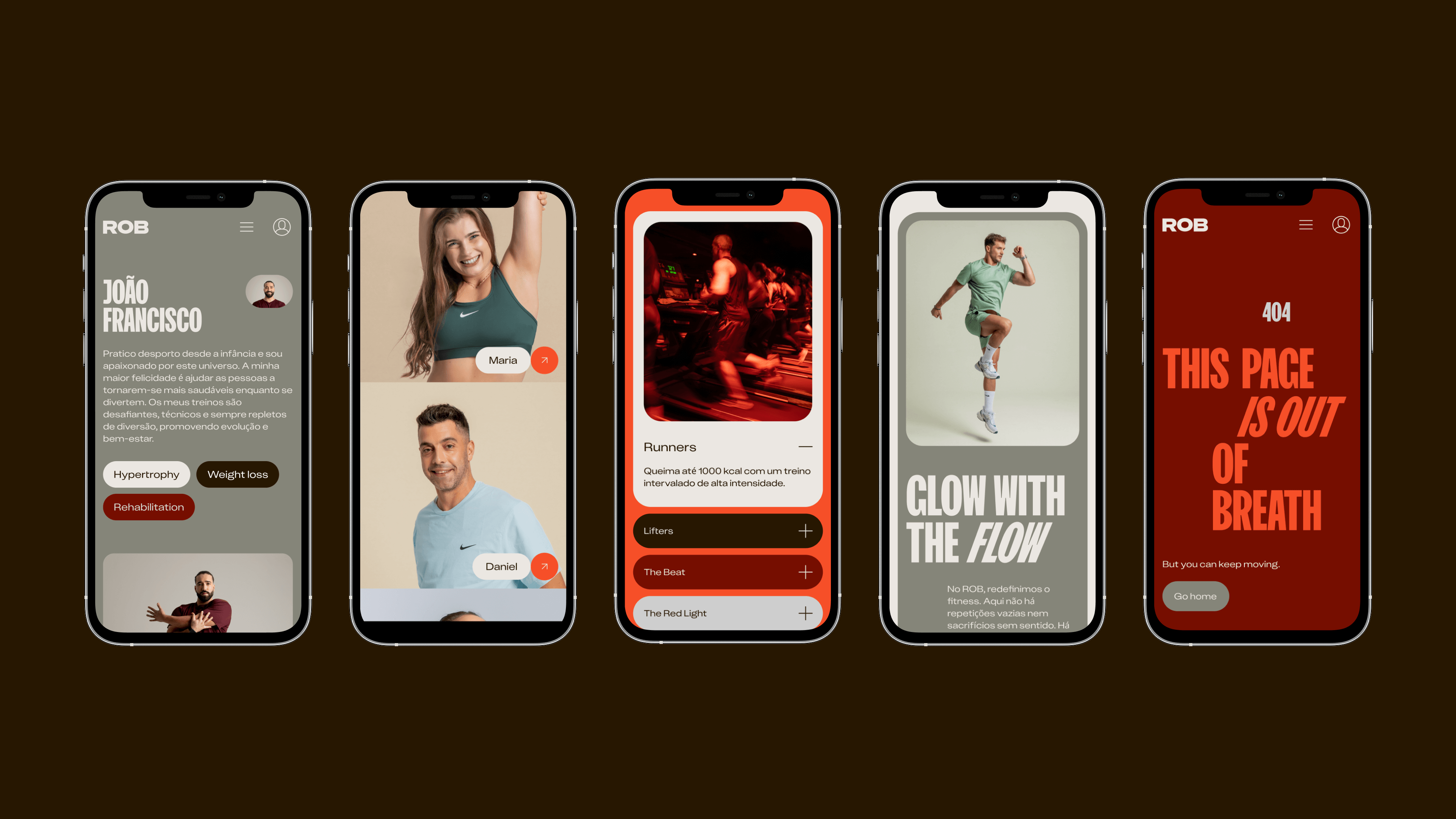
A bold, mobile-first website with clean UX, immersive visuals, and smart typography ready to convert browsers into believers.
Social media
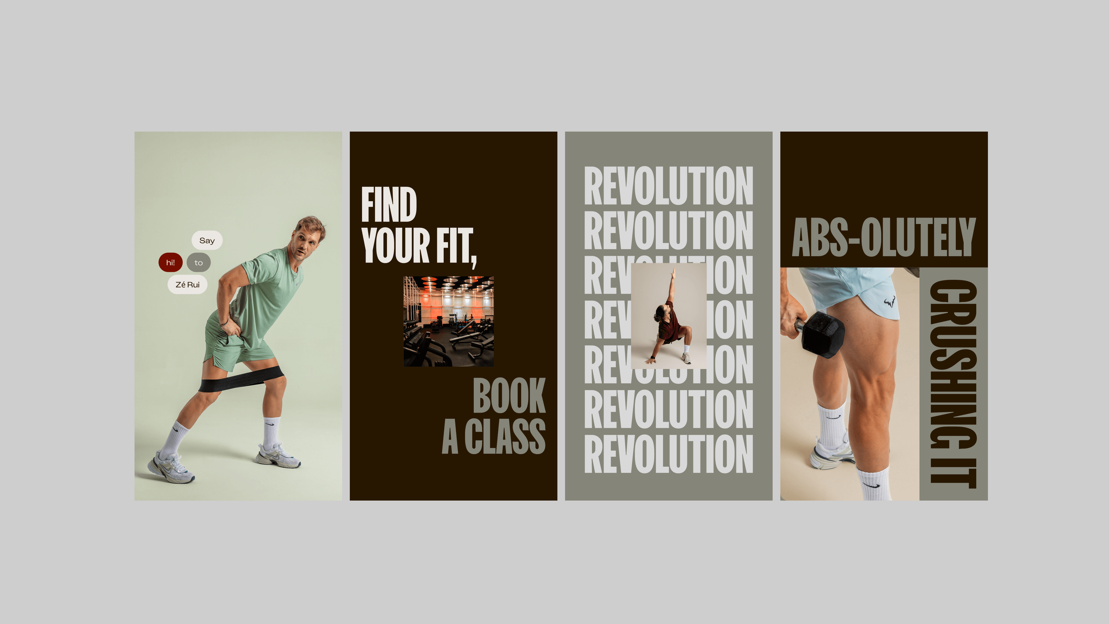
A style that's minimal yet bold, clean yet punchy. We created a visual language that mixes motion, strength, and personality. Think dynamic layouts, sharp typography, and confident color pops built to make every scroll stop-worthy.
Imagery
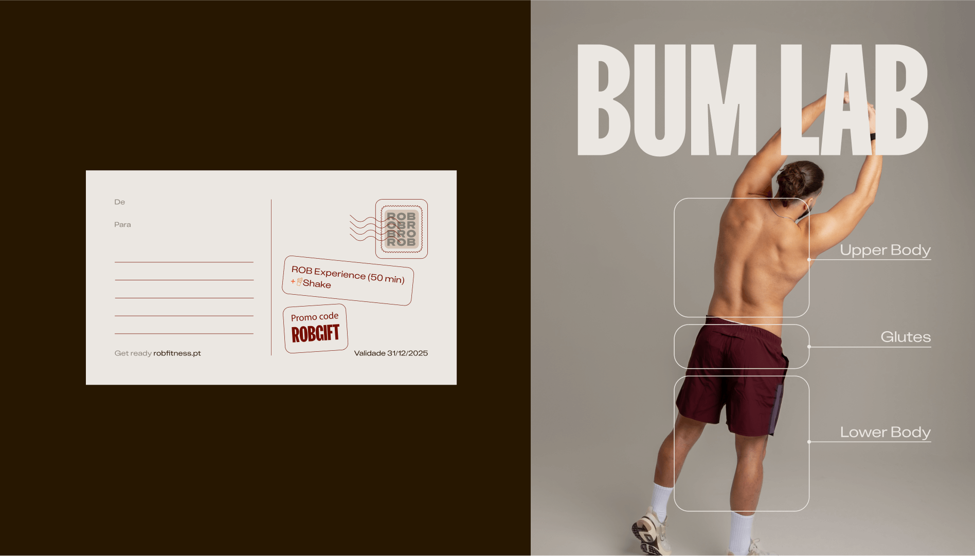
We directed a custom photo session to bring ROB's energy to life. No stock photos. No fake sweat. Just real people, real movement, and honest attitude. Every shot was designed to reflect the team's bold, sleek, and intimate feel.
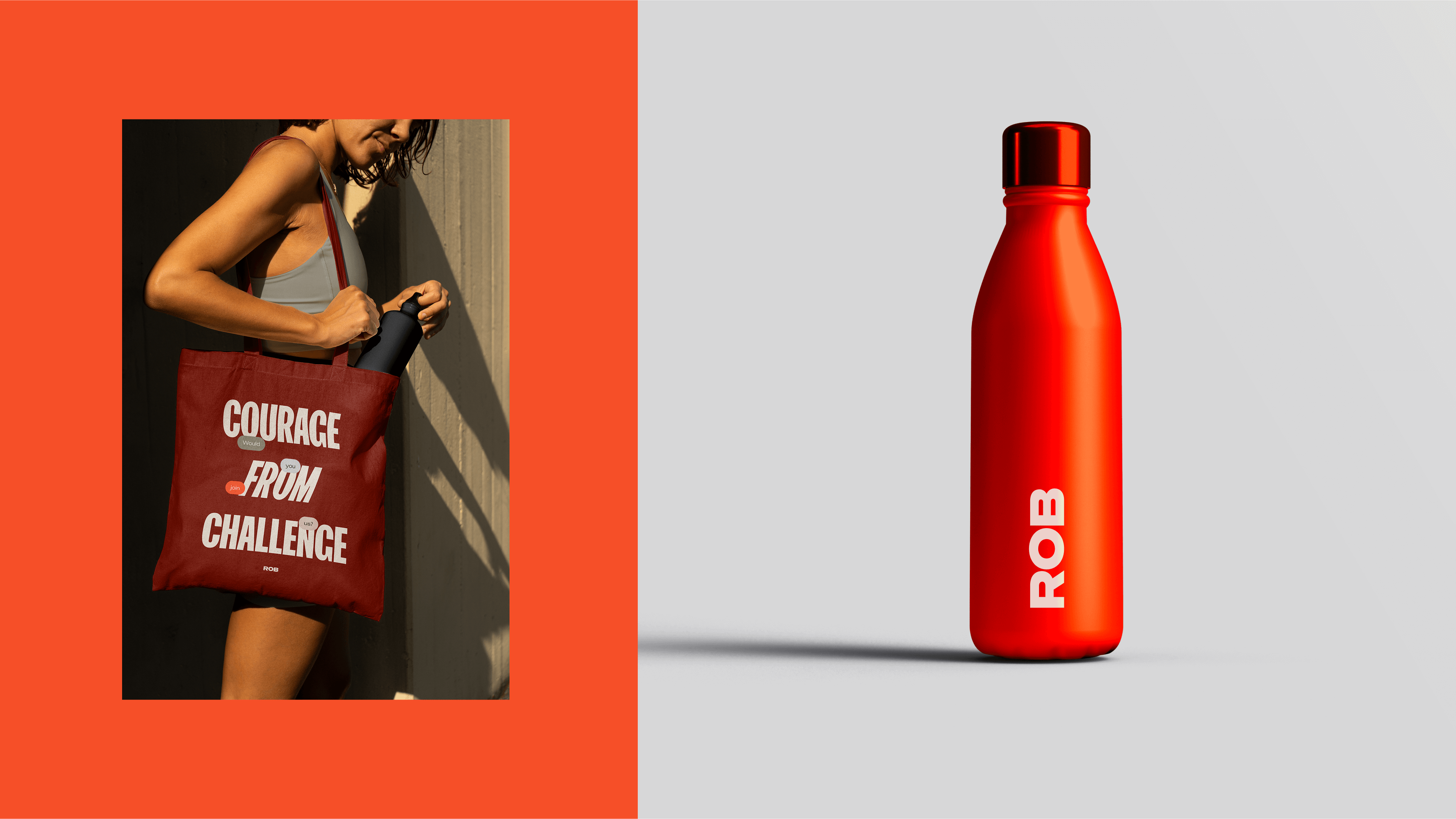
Physical
From signage to merch, every touchpoint was treated as an opportunity to reinforce the brand story and spark a connection.
The result
ROB launched with a clear message, a distinct visual presence, and a brand story that resonates with its growing community.
It's more than a gym; it's a rebellion and a return to self. And for us, it reminds us what good design can do when it meets a strong concept and a fearless vision.
ROB is proof that when you mix strategy, guts, and a damn good design system, you can turn a simple idea into a full-blown movement.
Let's say: this is one kind of revenge we were happy to be a part of.
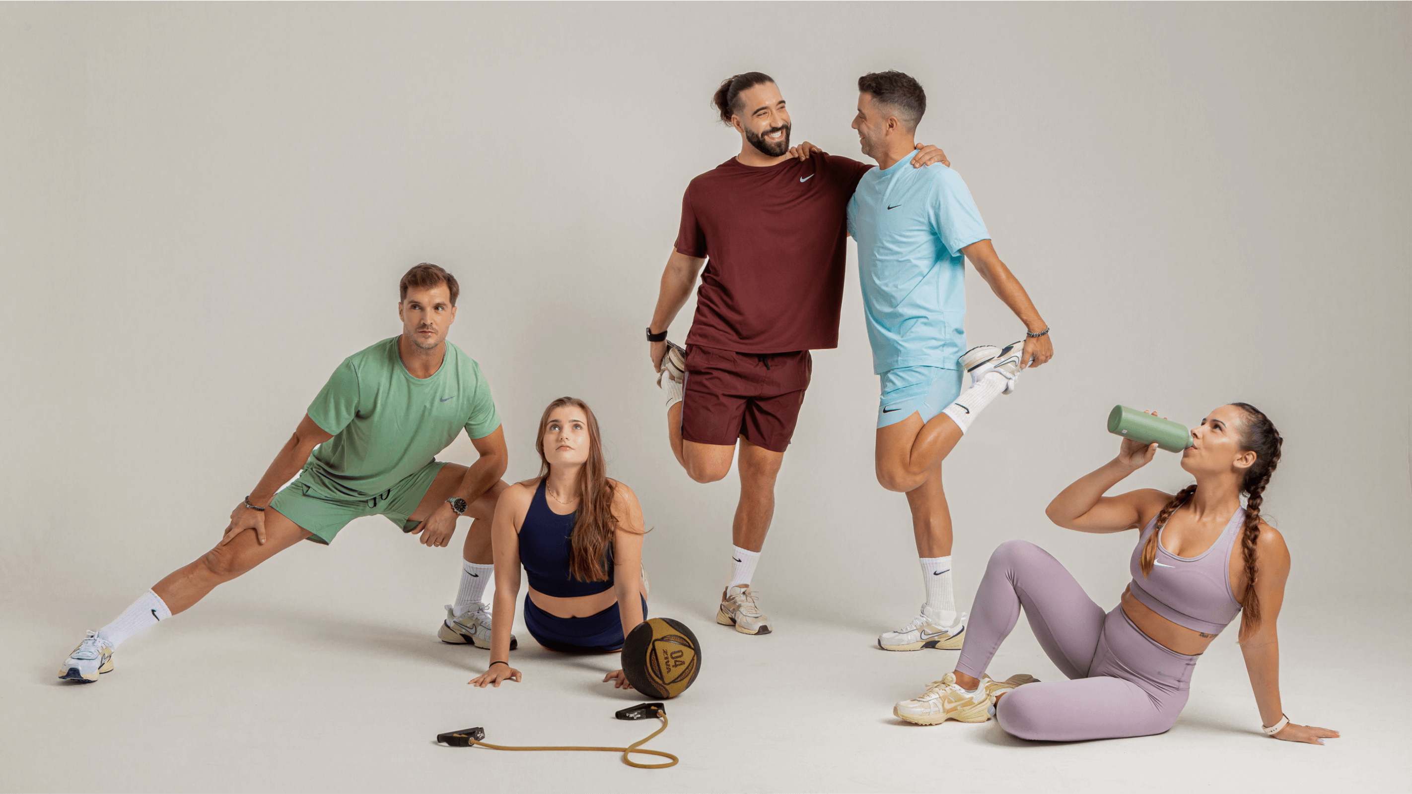
We directed a custom photo session to bring ROB’s energy to life. No stock photos. No fake sweat. Just real people, real movement, and real attitude. Every shot was designed to reflect the bold, sleek, and intimate feel of the team.
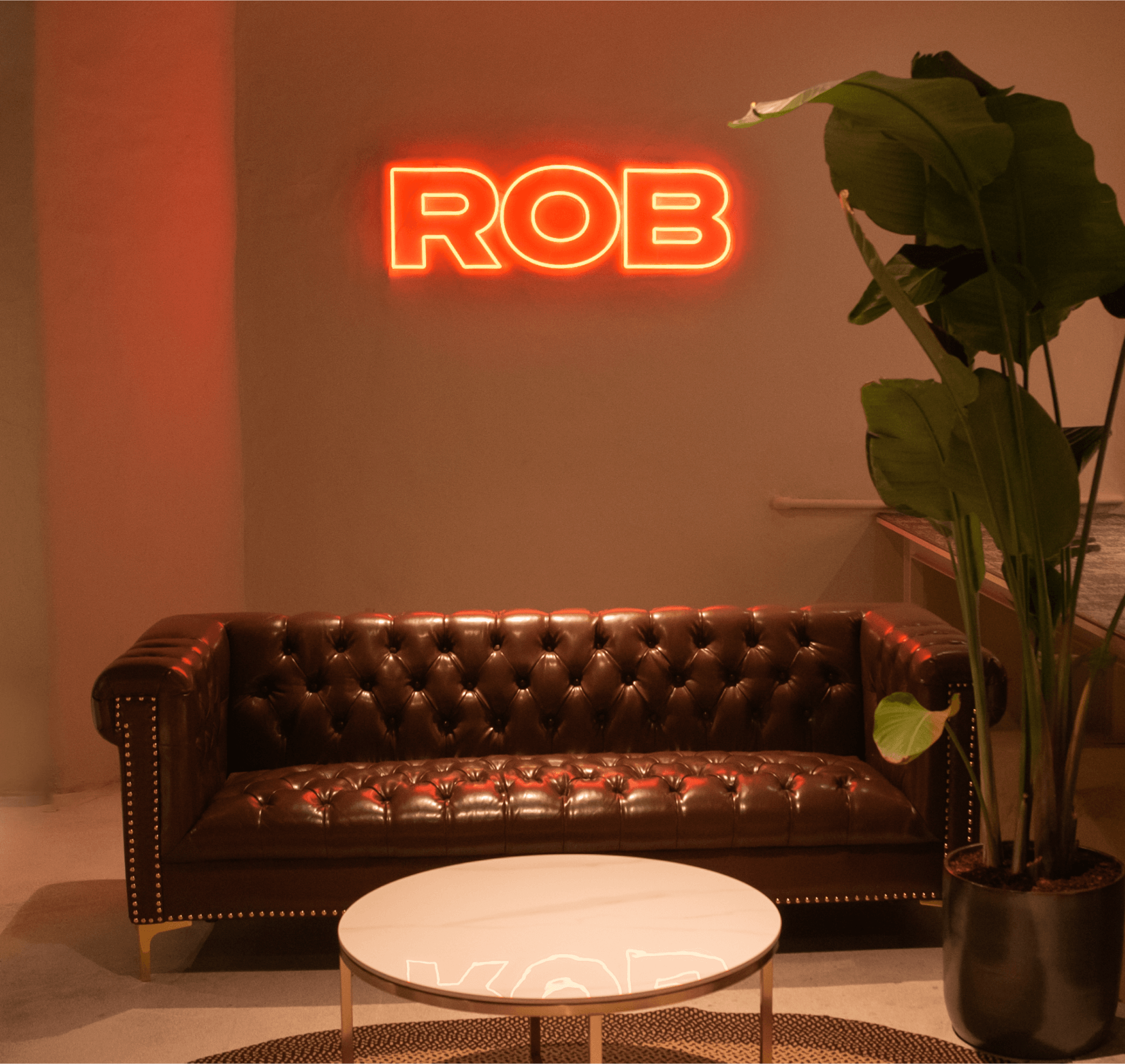
Every touchpoint, from signage to merch, was treated as an opportunity to reinforce the brand story.
We designed a bold, mobile-first website with clean UX, immersive visuals, and smart typography—ready to convert browsers into believers.