ABO Digital
ABO Digital – Designing beyond legacy
ABO Digital is the forward-looking daughter of Alpha Blue Ocean, an established global investment firm. Created to explore the Web3 frontier, ABO Digital brings the same strategic weight to a new generation of opportunities, now in a faster, more unpredictable world.
When they came to us, they weren’t looking to break away from their roots, they wanted to build on them. The challenge: to create a brand that could speak the language of Web3 while still echoing the credibility and sharpness of the Alpha Blue Ocean legacy.
We started with branding
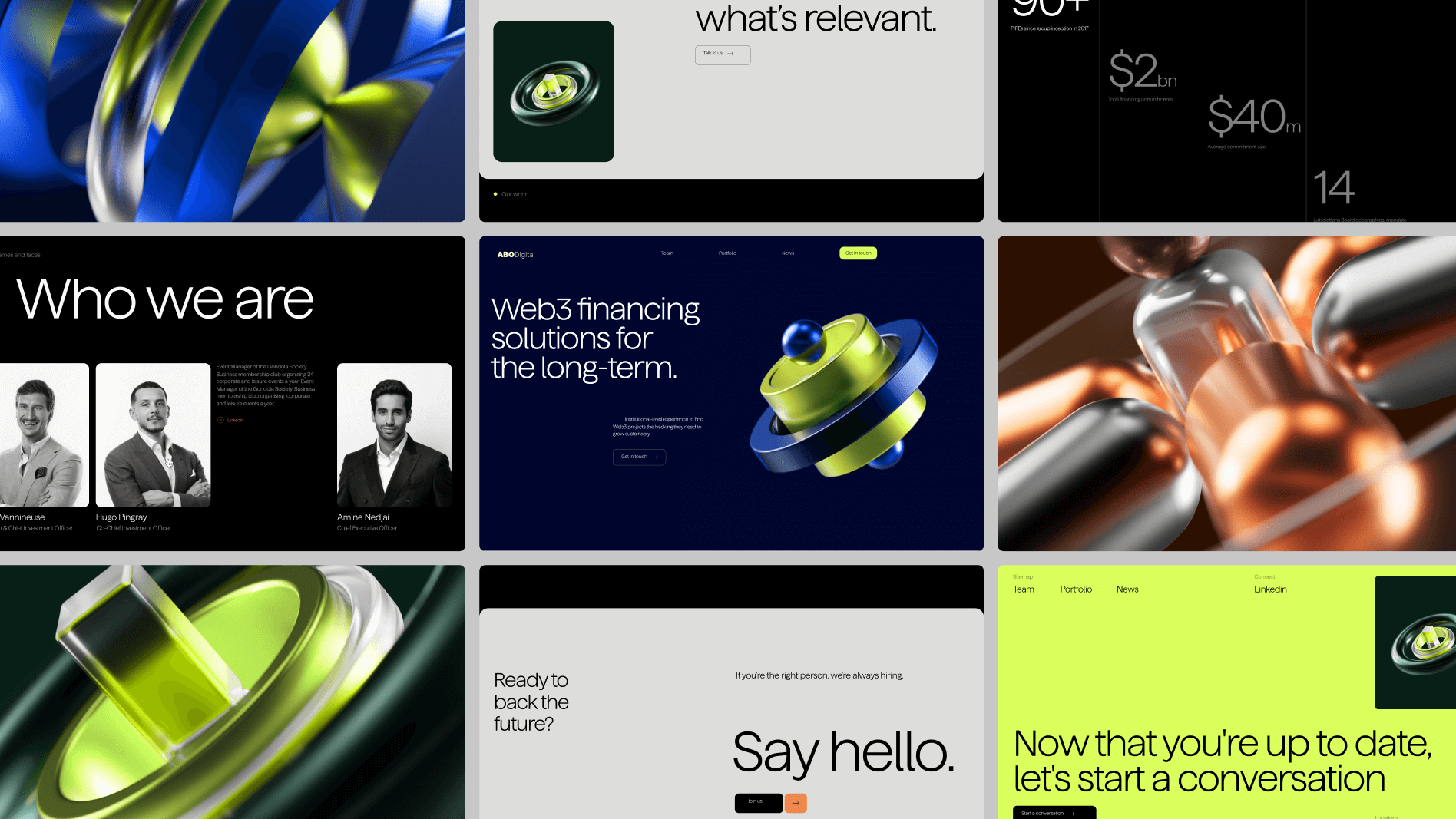
Rather than reinventing, we refined, keeping the connection to the parent brand while carving out a clear identity of its own. The result: bold typography, a stripped-back but commanding palette, and a symbol that reflects both continuity and confidence. It’s a brand that doesn’t shout, but still leads the conversation.
From there, we designed the website to match that clarity. It’s fast, precise, and deliberate, just like ABO Digital’s approach to investment. Every scroll, every transition, every micro-interaction reinforces one thing: they know where they’re going, and they move with purpose.
The copy, written by Mariana Machado, follows the same principle. No filler, no buzzwords — just intentional language built to speak to founders and VCs who value clarity, confidence, and speed.
We also collaborated with Serafim Mendes on 3D design, bringing motion and dimension to the interface in a way that amplifies, not distracts. The visuals are dynamic yet controlled, an extension of the brand’s exacting nature.
What emerged is more than a website or identity. It’s a launchpad, grounded in legacy, built for the new. ABO Digital is here to lead in Web3, not by abandoning the past, but by evolving from it.
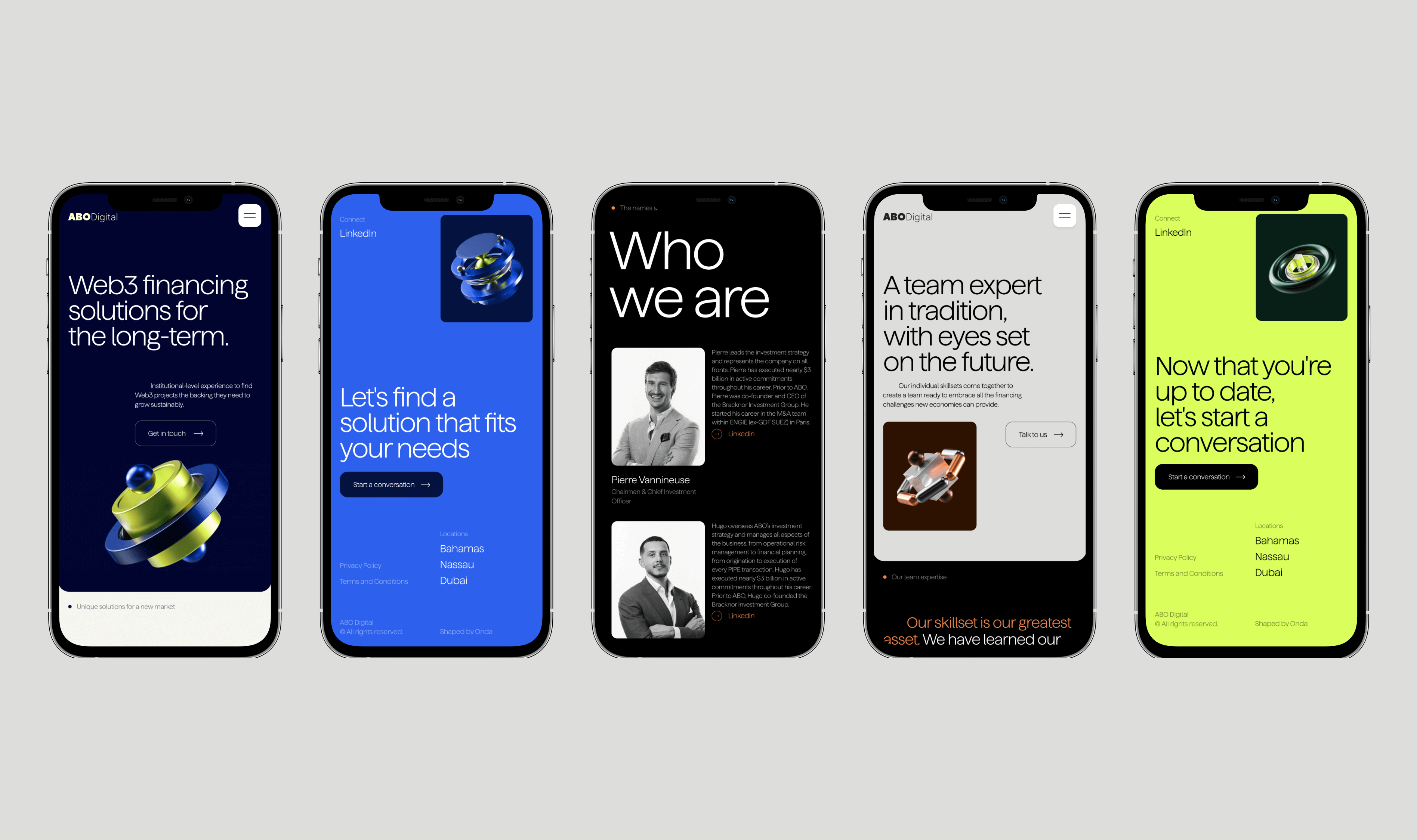
We leaned on motion graphics, creative coding, micro animations, and interactions to provide an engaging, friendly, and dynamic scroll experience to users.